DFA exercise
Today we will learn about discriminant function analysis (DFA). The
method is very similar to PCA, except that DFA finds axes that maximally
separate group centroids, whereas PCA axes maximize variation along axes
in ungrouped data.
As you learned in lecture, DFA is used for two primary purposes:
-
To help interpret the results of a MANOVA. MANOVA
provides us with evidence that group centroids differ, as evidenced by
the p-value on our multivariate test for differences between groups.
However, our MANOVA approach focused on testing for differences in
group centroids, but didn't help us understand the multivariate nature
of the separation between the groups - DFA provides us with these
methods.
-
Classification. DFA can be used to score data points
along DFA axes, and then assign them to the group whose centroid they
are closest to. Like PCA, this can be done with the data used to find
the DFA axes in the first place, or the DFA axes can be used to
classify new observations that were not used in the original analysis.
We will use DFA for both purposes today. We will use it to evaluate which
variables are most responsible for the differences between calico and
white clam shells in our shells data, and to develop predictive models
that can be used to predict land cover from reflectance values with our
LandSat data.
There are different forms of DFA, but we will be learning linear
discriminant analysis - the command we will use in R to do our DFA is thus
called lda(). For our purposes it's okay to use DFA and LDA
interchangeably, but recognize that DFA is a the broader term, and LDA is
one of the forms of DFA.
Shells
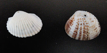 We don't really have any need to classify these shells based on their
measurements, because they are different enough in shape and coloration
that we can tell what they are by looking at them. Of the two uses for
LDA, we are thus more interested in using it to help us understand the
multivariate nature of the differences between these two species.
1. Preliminaries - new project, import the
data. Start RStudio, make a new project for today's activity,
download the Excel worksheet (multivariate_data_fixed.xlsx),
and then download and open today's Rmd file.
You can import the shells worksheet into a dataset called shells (don't
forget to convert it to a data frame as you import it!). Do this in the
code chunk labeled import.shells.data.
If you recall from our previous analysis of these data, calico and white
shells were significantly different, according to our MANOVA. We didn't
follow up with univariate post-hocs at the time, and since we switched to
a different data set to learn about interactions and post-hocs in MANOVA,
we never got back to them. I'll give you the univariate post-hocs now:
Response major.axis :
Df Sum Sq Mean Sq F value Pr(>F)
shell.type 1 193.78 193.777 24.808 2.188e-06 ***
Response minor.axis :
Df Sum Sq Mean Sq F value Pr(>F)
shell.type 1 279.41 279.411 53.083 3.921e-11 ***
Response surface.len :
Df Sum Sq Mean Sq F value Pr(>F)
shell.type 1 1.32
1.323 0.0852 0.7708
Response height :
Df Sum Sq Mean Sq F value Pr(>F)
shell.type 1 128.07 128.071 117.06 < 2.2e-16
***
Response depth :
Df Sum Sq Mean Sq F value Pr(>F)
shell.type 1 179.34 179.341 145.11 < 2.2e-16
***
Response ln.weight :
Df Sum Sq Mean Sq F value Pr(>F)
shell.type 1 11.607 11.6074 111.04 < 2.2e-16
***
Surface length is the only response variable that doesn't significantly
differ between the shell types. Univariate post-hocs are fine as far as
they go, but using univariate procedures to understand a multivariate
result isn't very satisfying - it's difficult to tell one variable at a
time whether the shells differ in size, or instead have some differences
in shape that best differentiate them.
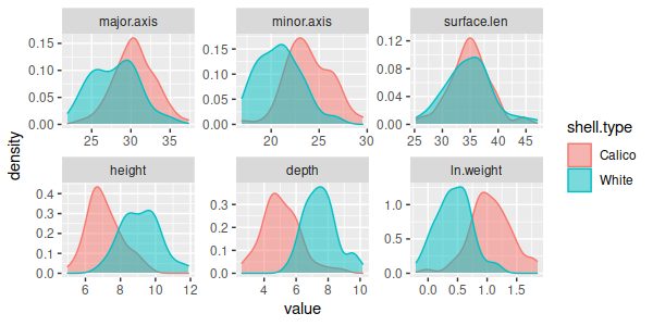
The separation between the shells one variable at a time is far from
complete, as well - there is a good deal of overlap between the species
for every variable, even those that have highly statistically significant
differences in mean. These graphs give the impression that the shells
overlap extensively on every variable, but we may find that the species
are completely non-overlapping if we look at combinations of these
variables.
LDA will find latent variables that describe the
multivariate group differences, which we can use to help us understand the
multivariate differences better.
2. Conduct the LDA. We will start by conducting the LDA
on the shells data. The function in R that conducts the analysis is called
lda(), and it is found in a library called MASS. To load the package, type
the command (load.MASS.library):
library(MASS)
Our lda() command thus looks like this (shells.lda):
lda(shell.type ~ major.axis + minor.axis + surface.len +
height + depth + ln.weight, data = shells) -> shells.lda
shells.lda
The model formula puts shell.type on the left where the response
variables go, and the measured variables on the right where the predictors
go, to emphasize that we're predicting group membership based on the
measured variables. The LDA axes are linear combinations of the measured
variables, so the predictors are all separated by + signs. This command
put the output from lda() into the shells.lda object, and then thanks to
the semicolon followed by shells.lda, the contents of shells.lda are also
dumped to the screen for your viewing pleasure. You should see this:
Call:
lda(shell.type ~ major.axis + minor.axis + surface.len + height +
depth + ln.weight, data = shells)
Prior probabilities of groups:
Calico White
0.5 0.5
Group means:
major.axis minor.axis
surface.len height depth ln.weight
Calico 30.4775 23.91333
34.98833 7.089167 5.084167 1.0597323
White 27.9360
20.86150 34.77833 9.155333 7.529167 0.4377096
Coefficients of linear discriminants:
LD1
major.axis -0.008631750
minor.axis -0.228773082
surface.len -0.002306157
height 2.736485922
depth 0.330688862
ln.weight -8.130160876
You'll see that the basic output reports the call (i.e. the command you
just issued to run lda), prior probabilities, group means for calico and
white shells for each measured variable, and the "Coefficients of linear
discrimination" that define the LD1 axis. With just two groups there is
only one axis to separate the groups, and it's called LD1.
We can use loadings of the shells on LD1 to help us interpret the
differences, but the lda() output doesn't have loadings. To get loadings
we need scores for the shells on LD1, which we'll get in the next step.
3. Calculate scores along the LD axis. We need LD1
scores now for plotting, and to calculate loadings in the next step. LD
scores are used to predict group membership, so we can use the predict()
function to obtain them. The command is (shells.predict.lda):
predict(shells.lda)
-> shells.pred
shells.pred
The predict() function is used to predict group membership based on the
measured variables. You'll see on the screen that the output is a list,
containing:
- $class - the predicted shell.type for each shell, based on how close
its score is to each shell.type centroid
- $posterior - the posterior probabilities of group
membership; these are calculated by taking the prior probabilities and
updating them with the information obtained from the LD axis scores
- $x - LD scores. The scores were generated by multiplying each shell's
measurements by the coefficients we got in step 1, and then summing them
(the means for each variable were subtracted first, so that the scores
are centered on 0).
Before we go on, a brief aside about predicting group membership:
Predicting group membership with a discriminant function
Note that the LDA in Abledu et al. was developed so that the LD axis
could be used to predict a person's sex from measurements of a
footprint. For other people to use an LDA you need to give them the
coefficients for the axis, and the cutoff point that separates the
groups. Let's look at how we can predict group membership without having
to rely on R's predict() function, using coefficients and cutoff values,
using shells.lda as an example.
We already have the coefficients (these are the LD1 "Coefficients of
linear discriminants" in the lda() output). To calculate the cutoff
between calico and white shells we just need to apply these to the means
for each of the variables - we can get the means with (in the Console):
colMeans(shells.lda$means) -> shell.means
which gives us the means for each variable:
major.axis minor.axis
surface.len
height depth ln.weight
29.2067500 22.3874167 34.8833333
8.1222500 6.3066667 0.7487209
These are actually the means of the two group means reported by lda(),
so they are also the midpoint between the group means.
Next, to use these to calculate the cutoff LDA score that separates the
two shell types we just need to multiply these by the coefficients - we
can do this by hand (or with a calculator, or with Excel, or with R) as:
-0.008 (29.21) + -0.229 (22.39) +
-0.002 (34.88) + 2.74 (8.122) + 0.331
(6.307) - 8.13 (0.749) = 12.77
This is the score that represents the cutoff point between a predicted
calico and white clam.
Calico clams get smaller LD1 scores than white clams on average, so we
would predict a score that is less than 12.77 to be a calico clam, and
scores above 12.77 to be a white clam. For example, if we had the
following measurements:
major.axis = 23.73, minor.axis = 16.96, surface.len = 27.1, height =
4.97, depth = 3.09, ln.weight = -0.02
we would plug them into the discriminant function:
-0.008 (23.73) + -0.229 (16.95) +
-0.002 (27.1) + 2.74 (4.97) + 0.331 (3.09)
- 8.13 (-0.02) = 10.68
Since the score for this shell of 10.68 is less than the cutoff of
12.77 we would predict that the unknown shell belonged to a calico clam.
The same scores used to predict group membership can be used to calculate
loadings, which is what we will do next.
4. Calculate loadings. Now that we have scores in
shells.pred, we can get loadings. Just like with PCA,
loadings are correlations between variables and axes, which we calculate
by correlating the shell data with axis scores.
First, as a convenience we can make a list of the measured variables we
used (shell.response.variables):
shells.responses <-
c("major.axis","minor.axis","surface.len","height","depth","ln.weight")
Then, you can get the loadings like so (shells.loadings):
cor(shells[shells.responses], shells.pred$x) ->
shells.loadings
shells.loadings
You will see that the correlations vary from close to zero for surface
length to a high of 0.75 for depth. Even though all of the variables aside
from surface length were significant in our univariate comparisons, the
loadings show that height, depth, and ln.weight all have the strongest
correlation with LD1, and major axis and minor axis have a smaller
correlation - since LD1 is the axis that separates the species this
suggests that the species differ more in their height, depth, and weight
than they do in their major axis and minor axis measurements.
The signs on the loadings are also meaningful, but it's hard to interpret
them until we know where the shell types fall along the LD1 axis. We'll
circle back and interpret the sign on the loadings once we've seen the
histogram of scores in the next step.
5. Graph the results. With only one LD axis the
preferred graph is a histogram of the LD1. This is the default plot type
for an lda object with just one LD axis, so you can get this graph using
(shells.plot.scores):
plot(shells.lda)
You'll see a set of two histograms, one for each shell type. Each
histogram uses the LD1 scores for the x-axis, and the axes are the same
for both of the histograms. By comparing them you can see that the
separation between the groups is really good, and you can also see that
the White shells have positive values on LD1, while Calico shells have
negative values on LD1.
Now that we know white shells have positive scores and calico shells have
negative scores we can interpret the loadings:
- height and depth have positive loadings, and since white shells have
positive LD1 scores this indicates that white shells have greater height
and depth than calico shells
- There are negative loadings for ln.weight, major axis, and minor axis
- since calico shells have negative LD1 scores this means that they are
heavier, and have larger major and minor axis lengths than white shells
- Putting these together, white shells have smaller lengths, widths, and
weights than calico shells, but they are more curved, which gives them a
greater height and depth. Since the surface length loading is near zero,
and not significant in our univariate tests, we're going to ignore it
here - the shell types have equivalent surface lengths.
Note that the differentiation between the shells was a shape difference -
if all of the variables had positive or all had negative loadings we could
conclude that the difference was one of size, but that was not the case
here. The fact that the groups separate much better using all of the
variables at once, and that the differences between them are a shape
difference, tells us that the differences are multivariate, and could not
be properly understood by looking at single variables one at a time.
6. Compare predicted to observed shell types - confusion matrix.
From the histograms it looks like the shells are very different, with
little or no overlap in their morphology. We can confirm this by
calculating a confusion matrix that compares predicted shell type to
actual shell type. Note that we're not really confused about which shells
are which, since they look different, but to the extent that the shells
can be correctly classified based on their measurements they are also
non-overlapping - the confusion matrix allows us to see how much overlap
there is between the species in their multivariate measurements.
To get the confusion matrix, use the command (shells.confusion.matrix):
table(shells.pred$class, shells$shell.type, dnn =
c("Predicted","Observed"))
The table command cross-tabulates the first variable (predicted shell
type) against the second (observed shell type). The dnn argument supplies
dimension names which are used as labels in the table.
You'll see that the two shell types are non-overlapping - all of the
predicted shell types were correct. This means that all of the white
shells were closest to the white shell centroid, and all the calico shells
were closest to the calico shell centroid.
Comparison between DFA and PCA
By now you can see that there are some similarities between DFA and PCA
- both produce eigenvalues, coefficients (the eigenvectors), and scores
that can be used to calculate loadings for interpretation.
LandSat
Our example of using LDA as a classification tool is the LandSat data
set. LandSat satellites record reflectance from the surface in seven
wavelength ranges (called bands), and different types of land cover tend
to reflect bands differentially. We perceive the differential reflectance
of visible light as color, but infrared bands can also be used that can be
useful for differentiating between cover types that look the same in the
visible part of the spectrum.
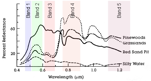
The figure to the left illustrates this point using four different cover
types. You'll see that different types of land cover reflect different
wavelengths of electromagnetic radiation to a different extent (five of
the seven LandSat bands are shown as the colored vertical rectangles
through the graph). If we look at the amount of reflectance of silty
water, you'll see that its line is low in every one of the bands, which
would give it a signature that is both low on average and flat across the
wavelengths. In contrast, the red sand pit has higher reflectance than the
silty water in all of the bands, and is particularly high in the green and
red visible portion of the spectrum (band 2 and 3). Grasslands are high on
band 4. the most difficult to distinguish would be pinewoods, since it is
close at least one other cover type on each of the bands, but it has a
different combination of reflectances than all of the other bands, so it
might still be possible to differentiate it.
LDA can be used as a kind of supervised classification,
meaning that LDA knows what the groups are that it's trying to classify,
and it comes up with the best predictor of group membership possible with
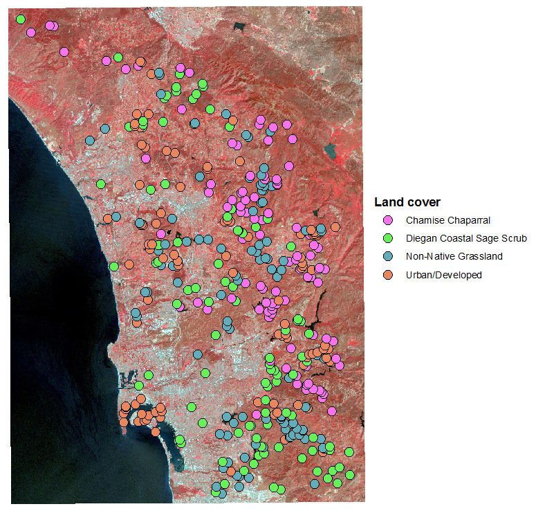
the data. To make this work, it's necessary to start with a set of points
for which the cover type is already known, and measure the reflectances
for all seven bands at each point. The points I used are shown in the
image to the left.
We have 50 points in each of the cover types to work with, each of which
has reflectances from a single pixel out of the landsat image. Each pixel
is a 30 x 30 m square, or 900 m2. Across all 90 points this is
45000 m2 that we have measured for each cover type. This is a
tiny fraction of the area covered by the map, so our points are a small
sample of the landscape.
To the extent that LDA is able to find axes that separate these cover
types as well as the shell types were separated, we will be able to
predict the cover type from pixel reflectances. We could then use the LDA
axes to predict the cover type of all the pixels in the image, including
ones with unknown cover types, as a way of mapping cover type over the
entire region. But, this will only work if the cover types differ
consistently in their reflectances.
1. Import the data, do the transformations.
Import the data from sheet "landsat" from "multivariate_data_fixed.xlsx"
into a dataset called "landsat" (import.landsat).
If you recall, we needed to log-transform every band except for Band 4
and Band 6 - do the log-transformations now (transform.bands).
You can also make a variables list for log.band1, log.band2, log.band3,
band4, log.band5, band6, and log.band7 - call it landsat.variables
(landsat.variable.names).
The cover type labels are pretty long, and they will be used as labels in
plots of the LD scores, so we should shorten them. Make a column with
abbreviated names (landsat.row.names.abbrefiated.cover.types):
landsat$ct <- as.factor(abbreviate(landsat$cover.type))
If you check your landsat data set there is now a new column called ct
with abbreviated cover type names.
2. Run the lda(). To run the lda, enter the command
(landsat.lda):
lda(ct ~ log.band1 + log.band2 +
log.band3 + band4 + log.band5 + band6 + log.band7, data=landsat) ->
landsat.lda
landsat.lda
which gives you this output:
Call:
lda(ct ~ log.band1 + log.band2 + log.band3 + band4 + log.band5 +
band6 + log.band7, data = landsat)
Prior probabilities of groups:
ChmC DCSS N-NG Ur/D
0.25 0.25 0.25 0.25
Group means:
log.band1 log.band2 log.band3 band4
log.band5 band6 log.band7
ChmC 4.202917 3.456613 3.482140 67.22 4.407366
144.52 3.661511
DCSS 4.251808 3.529610 3.572739 71.50 4.472402
148.24 3.702492
N-NG 4.228638 3.497988 3.565184 71.94 4.520316
150.72 3.677978
Ur/D 4.338845 3.631407 3.696178 77.80 4.510531
150.70 3.791580
Coefficients of linear discriminants:
LD1
LD2 LD3
log.band1 -5.64528569 -12.52305977 21.81166220
log.band2 1.85012837 4.88268785 -37.92582944
log.band3 5.38456123 -1.26311153 12.79056921
band4 -0.06877090
-0.04365170 0.08657798
log.band5 14.17160676 -0.03739565 -4.78362929
band6 0.05197806
-0.08812609 0.00115943
log.band7 -13.94435573 2.53912445 3.55563452
Proportion of trace:
LD1 LD2 LD3
0.5508 0.4291 0.0201
There are four cover types, so there are k -
1 = 3 LD axes this time, called LD1, LD2, and LD3 (with seven bands we
could have supported up to 7 axes, but with only four groups we get three
axes).
With more than one LD axis, we can ask how
much of the differences between the groups is accounted for by each axis -
there is now a new block of output below the coefficients called
"Proportion of trace" that gives a measure of the proportion of the
differences between the centroids explained by each axis (these are
calculated from the eigenvalues). As a worst case, it's possible that each
axis would only differentiate one cover type from all the rest, in which
case these numbers would all be pretty close in value to one another at
around 0.33. The first LD axis explains 55% of the variation, so there are
probably two or more groups that separate along this axis. Adding LD2 adds
another 43%, so 98% of the variation is explained by the combination of
the two LD axes, and the third contributes little to the separation of the
groups.
3. Plot the results. To get
an idea how well you can expect the classification to work, you can plot
the results of the lda using (landsat.plot.scores):
plot(landsat.lda, col =
as.integer(landsat$ct))
The default plot type for an lda with more
than two groups is a scatterplot of the scores, so you get a different
plot type for the same plot() command. The first two LD axes are used as x
and y by default.
Color coding by cover type makes it much
easier to see which cover types are separating best on each axis - the
less mixing of the colors, the better the separation. Since LD1 and LD2
are accounting for most of the separation between the cover types the fact
that the colors are overlapping a lot on the graph of LD1 and LD2 scores
is an indication that the separation will not be very good.
4. Predict group membership.
The final steps require us to predict cover types, so we will start by
predicting group membership from the LD axes for the data we used in the
lda() (landsat.predict.lda):
predict(landsat.lda) ->
landsat.pred
Given that we want to achieve the best
possible predictive accuracy with our landsat lda it might make some sense
to use unequal prior probabilities. Let's take a brief aside to consider
how the prior probabilities are used, and why you might want to set them
to be equal or not.
Prior probabilities
Notice that part of the output from landsat.lda is the prior
probability of group membership:
Prior probabilities of groups:
ChmC DCSS N-NG Ur/D
0.25 0.25 0.25 0.25
If you do not specify the prior probabilities to use lda() will assume
that the priors are equal to the relative frequency of the groups in the
data set. Since there are equal numbers of points from each cover type
the priors are equal.
These probabilities have no effect on the location of the LD axes - the
coefficients, eigenvalues, scores, and loadings will all be the same
regardless of the priors we use. But, when we use predict() the priors
will affect the predicted group memberships.
Why might we want to use something other than equal priors? If we
wanted to use this LDA to predict the cover type for every pixel in the
entire map, rather than just in the 50 points in each cover type we used
for this data set, we might want to make the prior probabilities equal
to the relative amount of land cover of each type in the county. If, for
example, chamise chaparral (ChmC) is really common but Diegan coastal
sage scrub (DCSS) is rare then any randomly selected pixel on the map
has a greater chance of being ChmC, before we have even looked at its
landsat reflectance data. If we used the landsat data to update our
prior probabilities we would increase the number of pixels that are
predicted to be ChmC, and decrease the number predicted to be DCSS,
which could lead to fewer misclassifications.
At this point, though, we would like to know which cover types are the
hardest to predict based on their reflectances. If we use equal priors
the predictive accuracy for each group will be based exclusively on how
distinct the cover type reflectances are, without biasing predictions
toward common cover types, and will give us the best information about
which cover types are distinct and which are not. We will stick with
equal priors for this analysis. If we were to then apply the LDA to the
entire landsat image later as a classification tool, we could switch to
priors proportional to the relative cover of each land cover type at
that point.
Now that predict() has calculated scores we can make a biplot, with
scores as the points and coefficients as vectors, similar to the biplots
we made for our PCA analysis. We can make our biplot with the command
(landsat.biplot):
biplot(landsat.pred$x, landsat.lda$scaling, cex = 0.5, xlabs
= landsat$ct)
The scores are the first argument, and they come from landsat.pred$x.
The LDA coefficients are the second argument, and they are in
landsat.lda$scaling. By default biplog() will use the first two columns
for each data set, which are LD1 and LD2. The "cex = 0.5" argument means
"character expansion", and setting it to a number between 0 and 1 shrinks
the text used for the data points so you can read them better (if they're
too small for you to read you can try cex = 0.7). The xlabs argument
identifies the abbreviated cover types in landsat$ct as the labels to use
for the data values.
Note that you'll have a couple of the bands that are right in the middle,
to the point that they overlap and are hard to read - if you look at the
coefficients from landsa.lda these are band 4 and band6, which have
coefficients near zero for the first two LD axes. This tells us that the
cover types don't separate in their band4 and band 6 reflectances on
either LD axis - we could probably simplify the LDA by dropping these two
predictors without affecting the predictive accuracy of the model.
If you want to plot LD1 vs. LD3 you can modify the command to (in the
Console):
biplot(landsat.pred$x[ , c(1,3)], landsat.lda$scaling[
, c(1,3)], cex = 0.5, xlabs = landsat$ct)
This specifies that columns 1 and 3 should be used in the plot.
From these biplots you should be able to see how the different groups are
separating on each of the three axes, and which of the variables are most
important for separating them.
We can also get histograms like we had for the shells - since plot()
won't give us a histogram of scores by default we will use the ldahist()
command directly, like so (landsat.ldahistograms):
ldahist(landsat.pred$x[,1], landsat$cover.type)
This produced a histogram of the first LD axis scores (which we specified
with landsat.pred$x[,1]), grouped by cover type. We can look at the LD2
histogram by changing the command to (in the same code chunk, just below
your first ldahist() command):
ldahist(landsat.pred$x[,2], landsat$cover.type)
Go ahead and check all three - you'll see that non-native grassland and
urban/developed separate best along LD1, and chamise chaparral and CSS
separate from urban/developed better on LD2. None of the cover types
separate well along LD3.
5. Test the significance of each LDA axis. One thing
you won't find in the lda() output is a p-value. You can use MANOVA to
test for significant differences between cover types across these seven
bands at once, and that is considered an omnibus test of significance for
an LDA using the same variables. However, the omnibus test of the LDA
doesn't tell us which of the three LD axes are responsible for the
separation between the groups. We can test the relative importance of each
axis in producing the significant difference between the cover types using
a one-way ANOVA of each set of scores. For the first LD axis scores you
can use (in chunk ld.significance.test):
summary(aov(landsat.pred$x[,1] ~ ct, data = landsat))
This command conducts an ANOVA of the LD1 scores (found in
landsat.pred$x[,1], the first column of the scores in landsat.pred) by
cover type. The ANOVA table is:
Df Sum Sq Mean Sq F value Pr(>F)
ct
3 104.8 34.92 34.92 <2e-16 ***
Residuals 196 196.0 1.00
The first LD axis scores are significantly different between the cover
types, so LD1 is contributing significantly to the separation of the
groups.
Use the same command to test for differences in LD2 scores
(landsat.pred$x[,2]) and LD3 scores (landsat.pred$x[,3]) in the same code
chunk. You'll find that the first two axes are needed to separate all four
cover types, but the third one is not significantly separating them -
there are two multivariate LD axes that are responsible for the
differences between the cover types.
6. Make a biplot with loadings
instead of coefficients. We can calculate loadings as we did
before with the shells (landsat.loadings):
cor(landsat[landsat.variables],
landsat.pred$x) -> landsat.loadings
landsat.loadings
which gives you:
LD1
LD2 LD3
log.band1 -0.27868833 -0.7831109 -0.152428955
log.band2 -0.22690903 -0.7436151 -0.294126917
log.band3 -0.09025575 -0.6343877 -0.105575881
band4 -0.04650736 -0.5760724 0.011750666
log.band5 0.20397445 -0.3429468 0.007066303
band6 0.31722042 -0.6330620
0.002829578
log.band7 -0.13546143 -0.3201659 -0.027103626
You'll see that the second LD axis has
negative correlations with all of the variables - LD2 is separating groups
based on differences in brightness across all of the wavelengths. LD1 has
a mix of positive and negative loadings, so it is separating groups based
on differential reflection of some bands and absorbance of others.
You can make a biplot of these loadings,
which will help you interpret what the reflectances for each cover type
look like. To make this plot, first assign the correlations to an object:
Now, to use these in a biplot, type
(landsat.biplot.scores.and.loadings):
biplot(landsat.pred$x, landsat.loadings, cex = 0.5)
You should get a biplot of the scores for the first two LD axes, with
vectors that indicate the loadings of the variables on these axes, just
like PCA biplots.
If you compare this biplot to the one you made using the coefficients
you'll see that the vectors for some of the variables point in different
directions using coefficients or loadings. Since they're not the same, you
should be wondering what they each are telling you.
Loadings and coefficients tell you different things about the analysis -
the coefficients are measures of how important the variables are for
separating the groups, but the loadings are useful for interpreting what
the points will look like given their scores. Based on the loadings,
points that are on the right of the biplot will have high reflectance of
band5 and band 6, and low reflectance of the rest of the bands. Points to
the top of the biplot will be darker (i.e. have low reflectance on all the
bands), and points at the bottom will be brighter (i.e. have high
reflectance for all the bands).
7. Make a confusion matrix for the
landsat lda. Now we need to calculate a confusion matrix, and
Cohen's kappa, to see how well we are discriminating our cover types. From
our various plots it's pretty clear that the cover types don't separate
completely based on reflectance, but we don't yet know how well we can
expect the classification to work. We can make our confusion matrix with
the command (landsat.confusion.matrix):
table(landsat.pred$class,
landsat$ct, dnn=c("Predicted","Observed")) -> landsat.confusion
landsat.confusion
There is a fair amount of overlap in spectral
signatures between the groups, so there are lots of classification errors.
All of the cover types except CSS are classified correctly most often.
R doesn't have a Cohen's kappa function built
in, but it's pretty easy to calculate. If you recall from lecture, Cohen's
kappa is the number of correct classifications minus the number correct
expected by chance, divided by the total observations minus the number
correct expected by chance. The correct classifications are on the
diagonal of the table "landsat.confusion" you just created. We can extract
them and sum them up with (in the Console):
sum(diag(landsat.confusion))
-> landsat.correct
landsat.correct
The number correct expected by chance for
each cover type is: (row total x column total) / (grand total) for each of
the diagonal elements, where predicted and expected are the same. If we
make this calculation for each cover type and sum them up we get the total
expected correct.
We can get row, column, and grand totals
with:
colSums(landsat.confusion)
-> col.totals
rowSums(landsat.confusion)
-> row.totals
sum(landsat.confusion) ->
grand.total
The total number expected correct by chance
would be:
sum(row.totals * col.totals)
/ grand.total -> landsat.exp.correct
landsat.exp.correct
We got 110 right, and only expected 50 by
chance. The raw rate of correct classification is:
landsat.correct /
grand.total
which is 0.55, or 55% correct
classifications. But, we would expect to be correct by random chance about
25% of the time (50 expected correct out of 200 points). So, how much
better than random did we do? Putting it all together, we calculate kappa
as:
(landsat.correct -
landsat.exp.correct)/(grand.total - landsat.exp.correct) ->
cohens.kappa
cohens.kappa
which shows we had about a 40% increase over
random chance by using our reflectance data to classify the cover types.
How good is our kappa? Generally, kappas over
0.7 are considered pretty good, those between 0.5-0.7 are moderate, and
below 0.5 are small. So, not too much success separating the cover types
by their spectral signatures with these data.
Statistical significance ≠ predictive accuracy
So, we have a statistically significant difference in spectral
signatures between the cover types, but the classification success is
not impressive. What does this tell us?
 Tests
of statistical significance are asking whether the centroids for the
groups are identical at the population level. Small
amounts of difference can be detected statistically with large sample
sizes, even when the data values overlap between the groups.
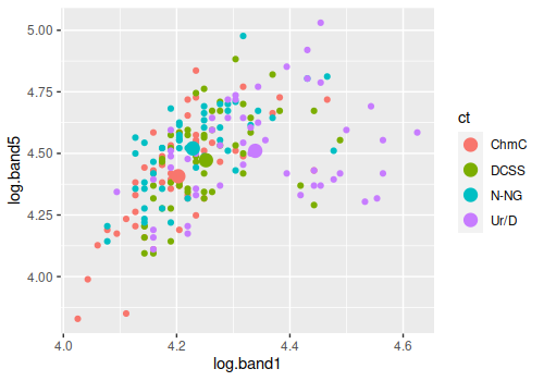
For example, the graph to the left shows the centroids for the four
cover types as large dots and the individual measurements as smaller
dots of the same color - I picked the two bands that had the largest
coefficients for the graph, so even though there are only two out of the
seven variables used as axes the separation between the groups is
visible.
Our MANOVA and our tests of the individual LD axes tell us that the
centroids are not the same, but all that tells us is that the different
location of the big dots is likely not just due to random chance. The
most different group is urban/developed given that its centroid is the
furthest from the other three, but the urban/developed data points
overlap extensively. If you were to randomly select an individual data
point and assign it to one of the cover types based on which centroid it
was closest to you would have a lot of mis-classifications - there are
many purple dots that are closer to the green (DCSS), blue (N-NG), or
orange (ChmC) centroids, and would be incorrectly classified as one of
those other cover types.
This means that the tests of significance and the
Kappa calculations are not contradicting one another, they are
addressing different questions - the tests of significance are
addressing whether the centroids are in the same location at a
population level, and the Kappa calculation is addressing how much
overlap is present in the data between the groups.
8. Make your own kappa function. The kappa calculations
weren't difficult, but there were several steps - the kind of thing that
we wouldn't want to have to do by hand repeatedly if we had lots of them
to do. We can write a function as an R script that has all of these steps
in it, source the function from our project directory, and then use it on
our confusion matrix.
To start, go to File → New File → R Script, and a new blank tab will open
up called "Untitled1"
|
Code to enter into your R script:
|
Explanation:
|
|
kappa.biol532 <- function(confusion) {
|
The first line of the script will define a new function, and
assign it to an object name - the object name is what you will
invoke when you run the function, so we'll call it kappa.biol532.
The function will just take one argument, the name of a confusion
matrix, and we will use the name confusion in the function
definition.
The opening curly brace means "what follows is the body of the
function". Enter this as the first line of your script. When you
type the { character the editor will add the closing }, which is
fine, just hit ENTER to separate them into different lines. All of
your commands go between the open and closing braces.
Since we're calling the confusion matrix "confusion" in the
function definition, that's the name that will be used by all the
commands within the function.
|
|
sum(diag(confusion)) -> correct
colSums(confusion) -> col.totals
rowSums(confusion) -> row.totals
sum(confusion) -> grand.total
sum(row.totals * col.totals) / grand.total -> exp.correct
(correct - exp.correct)/(grand.total - exp.correct) ->
cohens.kappa
|
Each line that follows is one of the steps in the calculation of
kappa that you just did
|
|
return(cohens.kappa)
}
|
The final two lines return the value of cohens.kappa, and close
the body of the function with a closing curly brace.
A closing brace is added when you typed the opening brace in the
first line of your script, but if you deleted it at some point
make sure the last line is the closing brace, and that there isn't
one anywhere else in the function.
|
You now have your first completed function, congratulations! Save the
script to your project folder - there is a "save" icon in the toolbar at
the top of the script window; click on it and save the script as
"cohens_kappa.R" in your project folder (make sure it's in the project
folder!).
To use your new function, switch back to your Rmd file and source the
file (in code chunk source.cohens_kappa.R):
source("cohens_kappa.R")
In R terminology, "sourcing" means to read code from a file. You should
see kappa.biol532 in your environment window. You can use it like any
function, write its name with the appropriate argument in parentheses
(calculate.kappa):
kappa.biol532(landsat.confusion)
and you should get 0.4 as the output.
Once we have the LandSat dfa, we could use predict() with a new set of
data to predict the cover types of other data points. We might do this
with points that we know the actual cover type for as a way of seeing how
well the model works when it's applied to new data. Once we have confirmed
that the model predicts well with new data we could apply it to all the
pixels in the LandSat image so that we can classify the land cover over he
entire region. We won't do these steps now, since the activity is getting
a little long, but if you have an application for DFA in your own work let
me know and I'll be happy to show you how it's done.
Optional - predicting group membership with more than one LD axis
We were able to come up with a method for predicting group membership
for the shells that was simple enough to calculate with a pocket
calculator. It's not as easy to do this when there are two or more LD
axes needed for the prediction like we have with the landsat data, but
the basic idea is as follows:
- Calculate the mean LD axis scores for each cover type from the data
that was used to develop the LDA model
- Score an unknown pixel along LD1, LD2, and LD3 using the
coefficients from the fitted LDA model
- Calculate the distance between the unknown pixel's LD axis scores
and each of the cover type mean scores
- Assign the pixel to the cover type it is closest to
The scores produced by using pred() on a fitted lda() have been
standardized, and would not be easy to use by anyone who doesn't have
access to the data set. We can publish the coefficients and let others
use them to calculate their own scores - they would need to make a
matrix out of them that was structured like this (which is just the
scaling section of our landsat.lda output):
LD1
LD2 LD3
log.band1 -5.64528569 -12.52305977 21.81166220
log.band2 1.85012837 4.88268785 -37.92582944
log.band3 5.38456123 -1.26311153 12.79056921
band4 -0.06877090
-0.04365170 0.08657798
log.band5 14.17160676 -0.03739565 -4.78362929
band6 0.05197806
-0.08812609 0.00115943
log.band7 -13.94435573 2.53912445 3.55563452
We would also need to provide mean scores for each cover type that
haven't been standardized - we can get unstandardized scores by
multiplying the landsat band data by the coefficients, instead of using
pred() - in the Console do:
as.matrix(landsat[landsat.variables]) %*%
landsat.lda$scaling -> ls.scores
We can then get means of these scores by cover type using aggregate() -
again in the Console:
aggregate(ls.scores, list(landsat$ct), mean) ->
ls.scores.means
The mean scores are:
Group.1
LD1
LD2 LD3
ChmC 15.70944 -46.69218 3.039349
DCSS 16.30556 -47.47549 2.705578
N-NG 17.45667 -47.63199 3.027444
Ur/D 15.65989 -48.49136 3.004777
We could publish these along with the coefficients. They could then
calculate distances between their own pixels and these means, and assign
the pixel to the group that the pixel is closest to.
For example, if we had a pixel with values of:
log.band1 log.band2 log.band3 band4 log.band5 band6
log.band7
4.16
3.434 3.526
57 4.419 138
3.761
we could put these in a vector, like so (in the Console):
c(4.16, 3.434, 3.526, 57, 4.419, 138, 3.761) -> pixel
and the coefficients in another (we'll cheat a little here and just
pull them out of the landscape.lda object - a user would need to make
their own matrix out of them, but we have them handy already, so we'll
save ourselves the typing) - in the Console:
landsat.lda$scaling -> coefficients
We get the pixel's scores on the three LD axes by matrix multiplying
the pixel by the coefficents - in the Console:
pixel %*% coefficients -> pixel.score
Now that we have the unknown pixel's score and the mean scores for the
cover types we can calculate distances between the pixel and these group
means - the distance between the first pixel's scores and the first
group's mean would be (in the Console):
dist(rbind(pixel.score, ls.scores.means[1,-1]))
which gives a distance of 1.70 from ChmC (ls.scores.means has means for
each LD axis for each cover type, and the first column has the cover
type name - dropping the first column leaves the mean scores for LD1,
LD2, and LD3 for the ChmC group).
If we calculate the distances from that same pixel to the rest of the
group means we get:
dist(rbind(ls.scores[1,], ls.scores.means[2,-1]))
dist(rbind(ls.scores[1,], ls.scores.means[3,-1]))
dist(rbind(ls.scores[1,], ls.scores.means[4,-1]))
which gives us distances of 2.64 from DCSS (row 2), of 3.38 from N-NG
(row 3), and 3.46 from Ur/D (row 4). The smallest distance of the four
is for ChmC, so this pixel would be classified as ChmC.
So, a bit of a pain, but it can be done. If you are working with your
own LDA it's much easier, since you will have the fitted LDA object, and
can just use the predict() function to get predicted group memberships
for unknowns.
Assignment
Knit and upload your Word file.
 We don't really have any need to classify these shells based on their
measurements, because they are different enough in shape and coloration
that we can tell what they are by looking at them. Of the two uses for
LDA, we are thus more interested in using it to help us understand the
multivariate nature of the differences between these two species.


 Tests
of statistical significance are asking whether the centroids for the
groups are identical at the population level. Small
amounts of difference can be detected statistically with large sample
sizes, even when the data values overlap between the groups.