Using LandSat data to make color composites
We will be working today with LandSat images. As you learned in lecture,
LandSat is an example of multi-spectral imagery, which records reflectance
of EM radiation from the earth's surface in visible wavelength bands, as
well as in several near- to mid-infrared bands.
Before we start to work with the LandSat images, though, we should learn
a little about image data in a GIS.
Thematic data vs. images
|
You worked with vector data last week, which is made up of
points, lines, or polygons drawn on a map. The second major kind
of GIS data is called raster data, which is made
up an array of "pixels", which are usually square cells. Each
pixel has a location recorded at its center, and a data value
associated with the pixel.
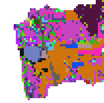
Raster data can be used in the same way as our land use layers
last week, to represent different categories of land cover. If we
had a raster representation of the land use in 2016 at the mouth
of the watershed, it might look something like this picture to the
right. Each color represents a different cover type, and the
pixels are large enough that you can see them individually. Since
the pixels hold codes that indicate the cover type, this is
considered thematic raster data - it is not just
raw measurements of light reflecting off of the surface, it has
been interpreted and converted into a set of land cover
categories.
|
|
|
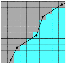
The picture to the right shows you how the pixel values would be
assigned - the black line represents an edge between two adjacent
polygons with different cover types, and the grid represents the
pixels that will be used to represent these cover types. All of
the gray pixels have their centers in the polygon to the left of
the black line, and all the blue pixels have their centers in the
polygon on the right. The assignment of pixels to cover type is
based only on the center of the pixel, and pixels overlap into the
adjacent cover type at various points along the edge. Pixels that
cross over the line are are only partially accurate, because they
cause some gray to fall into area that should be blue, and vice
versa.
Because of this effect, in a thematic raster map the most
accurate part of the pixel is the center, but edges of pixels may
not accurately reflect the cover type.
|
 |
Vector data is the opposite - when you digitized polygons in the last
lab, you recorded vertex locations by clicking along the boundaries of the
features you saw on the screen, so the place where you were making
positive choices to record information about cover type was at the edge.
The insides of polygons are treated as though they are homogeneous,
containing whatever cover type is assigned to the polygon, and because of
this you can expect to find small patches of other cover types within a
land cover polygon (any patch of cover that is smaller than the minimum
map unit won't be recorded, for example). Vector polygon data is most
accurate at the edges.
Digital images are another form of raster data. Images
are structured the same way as thematic raster data - images are arrays of
pixels with a single value each - but images are a little different in a
couple of ways:
- First, the imaging sensors record all of the photons reflected off of
the earth's surface within the entire pixel, so it's best to think of
the pixel value as an average intensity within the entire
pixel, rather than being the value at the center.
- Second, although we may have no trouble interpreting what feature or
cover type is present in the image when we look at it, the image only
actually contains data about reflectance of EM radiation within pixels.
There is no thematic information in an image, we have to supply that by
interpreting the image in some way.
We are going to work with LandSat images today to learn how to use
various bands to create false-color composites. We will still derive
meaning from the images based on manual interpretation of the images -
false-color composites are a visualization technique that make it easier
for us to see particular cover types, but they do not convert the image
into a thematic raster map. However, use of false-color composites can
greatly enhance our ability to manually interpret images by allowing us to
see bands that are outside of the visible part of the EM spectrum. Cover
types that reflect visible light similarly (i.e. are a similar color) may
reflect infrared bands differently, which can make it much easier to tell
those cover types apart. We will learn to classify pixels into cover type
categories based on their "spectral signatures" to make new cover type
maps soon, but for now focus on understanding how the available LandSat
bands give us different information about cover type that we can use to
see what would otherwise be invisible.
LandSat
 |
LandSat has contributed tremendously to our ability to monitor
our world. LandSat data has always been available to the public,
but before widespread availability of broadband internet,
distribution charges were fairly high. In the last few years the
USGS has made LandSat data available for download free of charge
to anyone who wishes to use it.
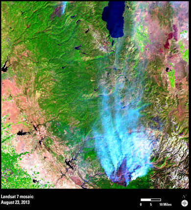
The image to the left shows the Rim Fire, which burned near
Yosemite National Park in 2013. Between the two LandSat satellites
that are currently operational (LandSat 7 and LandSat 8), each
location on the ground is imaged once every 8 days. LandSat 7
developed technical problems that make the data difficult to use,
but LandSat 8 records each location every 16 days. LandSat
satellites have been in operation since the early 1970's, which
makes it possible to use LandSat data to monitor changes on a
variety of time scales, from decades-long trends in cover type
conversion, to monthly or seasonal variation in vegetation, to
nearly real-time monitoring of acute events like fires.
Over the next two lab meetings you will learn how to use LandSat
data to visualize various aspects of land cover on a landscape,
and to quantify the amount of change in land cover over time.
|
Obtaining LandSat Data
To save time, I will be providing you with the data you need for today's
lab, but take a few minutes to look at how LandSat data are distributed.
There are a couple of web sites that USGS uses to distribute their
publicly available data, one of which is the Earth Explorer web site. If
you're interested in seeing how it would be done, read the gray box below
- otherwise, move on to today's activity.
Downloading LandSat data
USGS asks that you register for a free account to download LandSat
data, but you can go through every step of the process of finding and
selecting images without one, you will just be unable to actually
download the scenes you select - these instructions will walk you
through how you would obtain LandSat scenes, but don't feel obliged to
create and account unless you want to. You can reach the EarthExplorer
web site here
- the link should open in a new window with a world map on the right,
and controls on the left.
The first step is to identify the location for which you would like to
obtain data, which you can do by panning (i.e. click-holding the map and
moving it to place the location of interest in the center of the map)
and zooming (by clicking the + or - buttons, or moving the slider up and
down on the zoom control). Zoom in until you have a nice view of coastal
San Diego County (with Tijuana at the bottom of the map, and Oceanside
at the top).
Now, you can identify a coordinate of interest by simply clicking on
the point on the map you want. Click on San Marcos (the exact location
isn't important, as each snapshot, called a "scene" in LandSat
terminology, cover a fairly large area, and San Marcos is in the middle
of the scene). This will place a marker on the map, and will record the
coordinate in the "Polygon" control on the left, and then by clicking
"Use Map" the coordinates of the corners of the visible area in your map
are entered as the search area.
You can also specify the date range if you want, which by default will
start at 1/1/1920 and end on today's date. It's not a bad idea to change
the range to a narrower window, because search results are limited to
100 scenes at a time, and later data will not be shown if you start too
early. We'll be looking at LandSat 5 TM scenes, so you can start with
01/01/1984 and end with 01/01/1994. You could also narrow the search by
months if you were only interested in a particular time of the year,
such as springtime.
Next, click on the "Data Sets>>" button at the bottom of the
controls on the left. The controls switch to the next tab in which you
get to specify which data you will download. Find the "Landsat" option
and expand it, then expand Landsat Collection 1 - these are the best
available images from this date range, with the least amount of cloud
cover and processed to the point of being ready to use. Check the box
next to L4-5 TM to see the LandSat 4 and LandSat 5 Thematic Mapper
scenes available for your date range at this location. Collection 2
scenes are still made available, but they have defects that make them
less usable, such as cloud cover or optical defects. For our region it
is common for cloud cover to occur over the ocean and to cover part of
the coast, which might put the image into Collection 2, but if your
particular project area falles in the mountains of desert this may not
actually be a defect from your perspective - depending on your needs, if
you are unable to find what you want in Collection 1 it can be fruitful
to also search Collection 2 images.
The other options are data from other satellites with different types
of sensor; the L1-5 MSS are the earliest, dating back to 1972, but the
sensors didn't have all of the bands we would like to use, so we'll
stick to TM scenes (the LandSat 5 satellite had two types of sensors,
the MSS and TM, so it's included in two different options here). Notice
also that there are a lot of different types of data available - we
don't have time to learn about all of them, but if you're interested the
arrows in the orange boxes next to each option are links that will take
you to web sites that describe what they are.
Now, click on "Additional Criteria>>" to go to the next tab. Here
you can limit the scenes that you'll see to particular paths, amounts of
cloud cover in the scene, and various other criteria. The path refers to
the path of movement of the satellite with some overlap between adjacent
paths, and the row refers to where the snapshot was taken. Since there
is some overlap between adjacent paths and rows to make sure there is
complete coverage of the ground, you may be working in an area covered
by more than one scene, and can choose which you want to use here. It's
fine to leave these criteria blank.
Finally, click on "Results>>" to see the list of scenes
available. They are listed in reverse chronological order, with the
first one listed taken on 01/01/1994, and the last one listed taken on
3/23/84.
Each available scene has a thumbnail image, and you can click on it to
get a larger preview image of the scene, and to get a look at the
"metadata" that describes the characteristics of the scene. Depending on
your needs there are several pieces of information that might be of
interest, but the big things are the quality values (9's are good), and
the cloud cover (0 is good). Close the preview window if you opened it,
and look at the buttons next to the thumbnail images. The first on the
left is a foot - clicking on this will zoom to and show the outline of
the "footprint" of the image on the map. The next one to the right
superimposes the scene on the map, so you can see precisely what will be
covered (the footprint is a square that includes the scene, but doesn't
have the same dimensions as the scene - click both for the first image
to see how they are related). The second from the right is the one you
would click to download the scene. If you try it you'll be told you have
to be logged in to download - signing up is free, but don't worry about
this for now, I have already downloaded the data for today. You're
allowed to select more than one scene to download at once, so the last
button (red circle with a line through it) allows you to exclude scenes
you aren't interested in, and download the rest.
If you did have an account and logged in, clicking on the download
options would bring up a window that allowed you to select from a set of
various color composite images, or the "Level 1 Product" that contains
all seven of the available bands for the scene. We want all the bands,
so you would choose the Level 1 product.
File format and organization of data
LandSat scenes are distributed as a "tar.gz" archive. This file extension
is used for collections of files that have been combined together in "tape
archive" (tar, for short) form, and then compressed with "gzip"
compression (gz, for short). IF you had downloaded a file, then you would
find it on your disk in Windows Explorer, and then right-click on it. In
the popup menu, you would select "7zip", and unzip the tar.gz file into
its own folder. I've done that for you for today.
The LandSat scene we will work with today was taken on 4/15/11. I
selected that date because it was a Spring scene, with relatively
cloud-free views of the project area over the San Dieguito River
watershed.
To see the file formats and organization, start ArcCatalog and open your
P: folder connection (these should be saved and available between uses,
but if you lose the folder connection you can re-create it - the folder to
connect to is "Public on Viking (P:)" → "Biology" → "kristanw" →
"biol420620"), and then open "lab3". You will see that there are several
files within it.
- The actual images are "TIFF" files (short for "tagged image file
format", which uses a .tif filename extension), and there are seven of
them, one for each band. I have re-named the tif files as
"sp11_bandY.tif", where Y is the band number. These are actually a
special version of TIFF file called a "geoTIFF", which are used for
images of the earth's surface, and contain information about the
location of the image on the earth's surface, the sizes of the pixels,
and so on.
- The other file names are are all the same for the first string of 20
characters - before I renamed them to something more interpretable all
the tif files had this same first 20 characters in their filenames. When
I converted the tif files to geoTIFF these additional files became
unnecessary, but I kept them in the folder for you to get a better idea
of what is distributed in the tar.gz files. For example:
- The XXX_VER.txt file gives information about how the LandSat image
was "registered" to the real world - the images are of a curved,
topographically complex surface that was viewed at an angle, and the
images have to be flattened to make them properly display on a
2-dimentsional surface, like a paper map or a computer screen.
- The "XXX_MTL" file gives the "metadata" associated with the file,
including all the information needed to calculate reflectance from the
raw data.
- The "XXX_GCP" file gives a report on how the image was registered to
"Ground Control Points", which are identifiable features in the image
with known locations on the ground.
- If I hadn't renamed them, the bands would have had names like
LT50400372011105SPAC01_B1.tif for band 1, and the others would have
been the same except for a B2, B3, etc. in place of B1 after the
underscore.
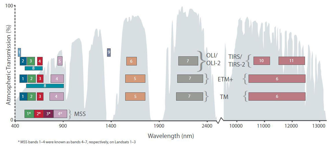
If you recall, LandSat images record not just visible light, but also
several bands in the infrared portion of the spectrum. For your reference,
this table and the graph to the right of it give information about each
band (the second row of boxes from the bottom, labeled TM, are the bands
from the Landsat 5 TM sensor that we are using):
|
Band No.
|
Wavelength Interval (µm)
|
Spectral Response
|
Resolution (m)
|
|
1
|
0.45 - 0.52
|
Blue
|
30
|
|
2
|
0.52 - 0.60
|
Green
|
30
|
|
3
|
0.63 - 0.69
|
Red
|
30
|
|
4
|
0.76 - 0.90
|
Near IR
|
30
|
|
5
|
1.55 - 1.75
|
Mid-IR
|
30
|
|
6
|
10.40 - 12.50
|
Thermal IR
|
120
|
|
7
|
2.08 - 2.35
|
Mid-IR
|
30
|
Notice that the sixth band is an oddball - it covers a wider range of
wavelengths and has a much bigger cell size than the rest. This is the
"thermal infrared" band, which is used for measuring surface temperature.
It's not terribly useful for the kind of land cover type assessments we
will be doing, so after we take a look at it we're going to leave it out
of the rest of our work.
Using LandSat in ArcMap
For today, we are going to focus on learning how to work with LandSat
data, and how to combine layers into true- and false-color composite
images.
1. Open ArcMap with a new map. Start ArcMap from
CougarApps. When the "Getting Started" screen appears, check that the
default geodatabase is still set to your monitoring.mdb file (if not you
can set it now), then switch to the "New Maps" → "Standard Page Sizes" →
"North American (ANSI) Page Sizes" → "Letter (ANSI A) Landscape" map
template, and click "OK".
Once the map window appears, click on the "Data View" icon in the lower
left corner of the map pane - you will no longer see the map template, and
will only have one set of coordinates showing as you move your mouse over
the map pane (if you recall, the data view only shows geographic
coordinates, and doesn't show position on the map page).
2. Add LandSat bands to the map.
We will add all seven bands to ArcMap.
- Click the "Add data" button and navigate to the lab3 folder on
P:.
- Navigate to the lab3 folder, and you'll see the seven bands are listed
with icons to the left of them that are grids of squares - the icon
represents pixels, and identifies the files as raster data. You can
select them one at a time by holding down SHIFT while clicking on each
name (all the sp11_band1.tif through sp11_band7.tif files, none of the
others) and then clicking "Add".
- Put them in order in the table of contents, with band 1 at the top -
if you end up with them out of order, you can drag them around in the
table of contents. If you're asked when you add the layers to the table
of contents whether you want pyramids built, say yes - this makes the
rendering on the screen much faster.
3. Open the image analysis window.
ArcMap organizes its image analysis into a single window, which you can
activate from the "Windows" menu - the "Image Analysis" option is the last
option in the list, like so:
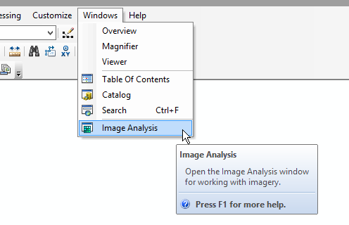
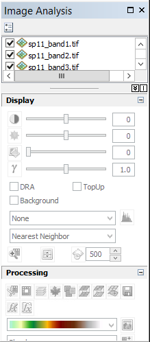
You'll see a window pop up like this:
You can dock this window out of the way on the right side of the map
panel - if you graph the window by its title bar (the blue-gray band at
the top) and start dragging it around the window you'll see that at the
right, left, top and bottom edges of the ArcMap window some indicators pop
up that look like this: 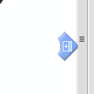 .
This one is on the right side of the window. If you click, hold, and drag
the image analysis window on top of this indicator, wait until you see a
blue-gray rectangle appear to show you where the window will be docked,
and then drop the window there, you will get the Image Analysis window to
dock out of the way along the right edge.
.
This one is on the right side of the window. If you click, hold, and drag
the image analysis window on top of this indicator, wait until you see a
blue-gray rectangle appear to show you where the window will be docked,
and then drop the window there, you will get the Image Analysis window to
dock out of the way along the right edge.
4. Compare individual
layers. Each of the seven bands should be listed in the box at
the top, and if they are in order fro band1 at the top to band7 at the
bottom the map is displaying Band 1 - like the table of contents, the
top-most layer is drawn last, and is thus on top of the rest, and what you
are seeing is the EM radiation recorded for Band 1.
If you look at the table above giving wavelengths recorded by each band,
Band 1 is blue visible light. Since only a single band is being displayed,
ArcMap is rendering the data as a gray-scale image. Light areas indicating
high reflectance of blue light, and black areas indicating low reflectance
of blue light.
Look over band 1 and notice where the variation in shade occurs in the
image. Some features seem pretty easy to pick out - this suggests that
have very different amounts of blue light in their color compared with
their surroundings, and the contrast makes them easy to see. For example,
you can probably identify highway 15, which is a thin white line about 1/3
of the way from the west edge of the image.
We can't use the trick we used last time to make the watershed polygon
see-through so that we could see the image behind - all the images fill
the entire area. One way of comparing them is to turn the top layer on and
off - if you un-check sp11_band1.tif in either the image analysis window
or in the table of contents you'll be able to see sp11_band2.tif, which is
the next highest in the drawing order.
This doesn't always work so well, though, because big images can take a
long time to draw. It's possible to get a better, more convenient
comparison using the swipe tool. Do the following:
- In the Image Analysis window, select sp11_band1.tif.
- Click on the swipe tool to activate it - it's in the "Display" block
of the image analysis window, just above "Processing, and it looks like
this,
 .
.
- Now, click and hold over the image - you'll see that band 1 is
displayed from the top down to your mouse pointer, but band 2 is
displayed below that line. If you hold your mouse button down and move
the mouse you'll see the dividing line between the layers moves with
your mouse.
As you look at features that stand out clearly on Band 1, note that
sometimes they are not as obvious in Band 2. This happens when the colors
differ in the amount of blue (recorded by Band 1), but not in the amount
of green (recorded in Band 2) that make them up, and because of that you
can tell them apart using just Band 1, but not using only Band 2. The
converse will also be true - some colors are very different in the amount
of green they contain, but have the same amount of blue - you will be able
to tell them apart using Band 2 but not Band 1.
Turn off band 1 (un-check it), and set band 2 to be the swiped band by
selecting it in the Image Analysis window. As you swipe away band 2 you'll
see that band 3 (red) shows different patterns than band 2. Particularly
note how the water bodies change in appearance - band 3 is very strongly
absorbed by water.
Continue to turn off layers and select the top-most visible layer to
swipe until you have gotten through all of them. Note how the contrasts
change as you look at each successive band. Pay close
attention to Band 4 and above, because those are
infrared and not visible to the human eye - there are some features that
look quite different in the infrared part of the EM spectrum, and we can
take advantage of that to help us distinguish land cover types with
similar colors.
5. Create a "true color" composite.
Now that we can see that each layer shows us something different about
land land cover, we can combine three bands together into color composites
that will be even more informative.
Remember from lecture that computer monitors make all the colors we see
by mixing red, green, and blue light together - on the computer, we refer
to these as the red, green, and blue channels. We can
make a color image from our Landsat bands by assigning
them to the color channels on the monitor.
To get ArcMap to do this assignment of bands to channels, we first need
to make a color composite from the Landsat bands -
simply, we just need to group together all seven bands into a single
composite image, and then we can assign the layers as we like to the color
channels as we like.
- Check the boxes next to all seven bands, and select all of them in the
Image Analysis window.
- In the Processing section of the Image Analysis window (second block
from the bottom), you will see several buttons, and the third from the
left looks like three sheets of paper held in parallel with one another,
like this:
 . If you
hover over the button you'll see this is the "Composite Bands" tool.
With all seven of the bands selected, click this tool.
. If you
hover over the button you'll see this is the "Composite Bands" tool.
With all seven of the bands selected, click this tool.
You should see a new item called "Composite_sp11_band1.tif" added to the
table of contents, and to the Image Analysis window. You should also see
that the image now looks something like a color image, but the colors are
off. To make a true color image, we need Landsat band 3
to be assigned to the red color channel, Landsat band 2 to be assigned to
green color channel, and Landsat band 1 to be assigned to the blue color
channel - when we made the color composite bands 1, 2, and 3 were assigned
to Red, Green and Blue, which means that band 1 and 3 are assigned to the
wrong color channels.
**Note: there appears to be a bug in ArcMap that changes all of
the band names to Band_1 - this is confusing, but they are in the same
order as in the Image Analysis window, so the first Band_1 is indeed
Band 1, the second Band_1 is actually Band 2, and the third Band_1 is
actually Band_3, and so on.**
To assign the bands to the right color channels in the map, click on the
red square (which is the red color channel for the monitor) next to "Red:
Band_1", and select the third entry in the list (that is, the third Band_1
entry in the list, which is actually Band 3). Now do the same for blue
(which is the blue color channel for the monitor), but assign the first
Band_1 to it (which is in fact Band 1, which is visible blue light). Band
2 was correctly assigned to green, so no change is needed. The result
should look like an aerial photograph, with colors that match what you
might see yourself if you were looking down from space.
The name assigned to the composite is pretty uninformative, but we can
change it:
- Select "Composite_sp_11_band1.tif" in the Table of Contents,
right-click, and select "Properties".
- In the "Layer Properties" window, switch to the "General" table, and
change the "Layer Name:" to "Landsat_composite_sp11".
This is not a permanent file, by the way - if we quit without saving a
map file and re-started it would be gone. That's not a big deal because
it's easy to re-create. If you do save a map file for this lab and then
open it again later, ArcMap will re-create the composite for you, but it
would not save a seven-layer image to your computer, it would just make a
composite for display "on the fly". If you wanted a permanent version of
this seven-layer image you would need to export to a file, or to your
monitoring.mdb database. We don't really need a permanent version of it,
so we will just use this on the fly composite instead.
6. Compare the true color Landsat composite to a high-resolution
layer.
Zoomed to the watershed level, the image looks pretty crisp, but remember
that each pixel in this image is 30x30 m. We will use imagery that comes
from the USDA's National Agricultural Imagery Program (NAIP), which
produces high-resolution aerial imagery for much of the US every few years
(we have an image from 2012). It has the same 1 foot resolution as the
World Imagery layer we used for digitizing polygons last time, but it also
has a fourth band that records near-infrared EM radiation - we'll make use
of that in the next step. But first, let's see what Landsat's 30x30 m
pixel size does to your ability to manually identify features on the
ground.
First, un-check the boxes next to all of the bands, but leave the
composite turned on - every time ArcMap needs to update to reflect a
change you've made it has to re-draw all of the checked layers, and that
can be slow. Un-checking the layers you don't need to look at speeds up
redrawing a lot.
Then, add the "NAIP 2012 4Band.lyr" file (which is actually a file that
tells ArcMap where on the internet to get the imagery - it is hosted on
the State of California's servers). Put it below the Landsat composite.
Also add the "Athletic_fields.shp" layer, then right-click on it and zoom
to its extent - this will take you quickly to an area with some features
that are easy to see with the 1x1 foot pixel NAIP image, but look blocky
and pixellated using the Landsat image. Using the NAIP image (with the
Landsat composite turned off) you will see San Pasqual High School in
Escondido, and a little of the surrounding housing developments to the
east, a golf course to the south, and Kit Carson Park to the west.
If you turn on the Landsat composite now there is still some color
variation, and if you know what's there you can tell that the blob of
whitish gray is due to the roofs of the high school buildings, and the
greenish blobs to the south and east are golf course and athletic fields,
but if you had only this image you would have difficulty knowing what you
were seeing - a few 30x30 m pixels are all that is needed to cover the
entire football field, and that is certainly not enough to tell what it
is. But, minimally you can tell that there is some green over the football
field and over the
7. Create a color infrared "false color" composite. Any
composite that assigns bands other than red to the red channel, green to
the green channel, and blue to the blue channel is considered a "false
color" composite. We sort of did one already when we composited the
Landsat layers and accidentally assigned the blue layer to the red
channel, and the red layer to the blue channel. But, the purpose of false
color composites is not to just make trippy images, it's to allow us to
see parts of the EM spectrum that we can't see with our eyes.
A very common false color assignment is to assign the near-IR band to the
red channel, the visible red band to the green channel, and the visible
green band to the blue channel. This is the color infrared
false color composite, and it is so commonly used that it is sometimes
called the standard false color image.
Go ahead and do the assignment for the NAIP image - Band_4 (near IR) to
red, Band_1 (visible red) to green, Band_2 (visible green) to blue (the
band numbering is different for NAIP than for Landsat). You'll see lots of
dark red in undeveloped areas, and really bright red in golf courses, and
other well-irrigated places. This color infrared combination is good for
identifying healthy, growing vegetation from unhealthy vegetation, and
vegetated areas from unvegetated areas.
Zoomed into the althletic fields layer (do so if you weren't already)
you'll see something interesting - even though the football field was
brighter green than the baseball field using the true color assignment, it
is not red at all when we use near infrared radiation. This is because the
football field uses artificial turf, which is green in color but not
photosynthetically active. We will be able to make important distinctions
using infrared bands that we would not be able to make using only visible
light.
Go ahead and make the color infrared assignment with the Landsat
composite now - the bands are numbered differently, so the assignment is
Band 4 to red, Band 3 to green, and Band 2 to blue. At this zoom level you
will be able to tell that the blob that is the football field is
blue-gray, while the blob that is the baseball field is red - the
individual pixels do tell us something about what is happening on the
ground at that point, but the coarse resolution makes Landsat imagery
unsuitable for visually interpreting fine detail.
Zoom out to the extent of the Landsat composite, and you'll see again
that variation in the intensity of red is revealing differences in
healthy, photosynthetically active vegetation and dead or dormant
vegetation that was not so obvious before.
8. Create additional false-color composites.
Just as the Landsat 4,3,2 composite is good for green vegetation, other
combinations are good for other things. A summary of some of the common
ones is in this table:
|
Band assignment
|
Appearance and uses
|
|
4,3,2
|
Standard false color image. Vegetation is in shades of red, urban
areas are shades of light blue, soil is dark to light brown.
|
|
7,4,2
|
Similar to natural color, but better at penetrating atmospheric
particles and smoke. Healthy vegetation is bright green, sparse
vegetation is orange or brown. Urban areas are varying shades of
magenta. Dry vegetation is orange, and barren soil is pink.
|
|
4,5,1
|
Healthy vegetation displays shades of red, brown, orange, and
yellow. Soil is green or brown. Urban areas are white, light blue,
or gray.
|
|
4,5,3
|
Colors are similar to 4,5,1 but with better discrimination of
land/water edges.
|
|
5,4,3
|
Healthy vegetation is bright green, and soil is pale lavender.
|
Zoom out to the extent of the Landsat composite, and then do each one of
these band combinations. For each one zoom in and out to do a closer
inspection of some of the conspicuous features - pay close attention to
the lines of separation between different colors, as those are edges
between cover types that we would like to be able to see for mapping
purposes - some edges will be easy to see with one composite but hard to
see with another. Note that you won't be able to do these band
combinations with the NAIP image because it only has four bands, but you
can still use it to help you interpret what you're seeing in the Landsat
imagery (the swipe tool is helpful for this).
We're just scratching the surface on this topic - if you're interested
and would like to learn more about selecting band combinations for various
uses, see this
article.
All done
Save a lab3.mxd map file so you can refer to it in your mini project 1
report.