
We now know how to obtain and work with LandSat data, and how to calculate a measure of vegetation greenness from reflectance in the red and near-infrared bands using NDVI. The next step is to use it to figure out how to derive cover type thematic information from the images.
Land cover is the material at the surface of the earth, and cover types are categories of land cover. The materials we find on the surface are extremely variable, including anything from buildings, to vegetation made up of a wide range of different species of plant in varying combinations, to soils of different types and moisture contents, to various kinds of wetlands, to housing developments of varying ages, lot sizes, and degree of natural or artificial landscaping. When we apply cover types, no matter how many categories we use, we will need to apply discrete category names to this vast diversity of surface cover we find within our watershed.
If you think about that, it should make you a little uneasy.
Think just about the variety in man-made land cover. If we define a "developed" cover type to indicate an area that has been developed by people, it could be covered by anything from pavement to a botanical garden. We could be more specific and define a category for "suburban housing development", but this encompasses everything from the high-density, tightly packed, new developments around campus to the low-density mini-ranches in Rancho Santa Fe. The mini-ranches in RSF will primarily consist of bare ground, grass, and ornamental landscaping, whereas the high-density housing will be primarily covered by roofs, concrete, and blacktop, with only a little vegetation.
The problem is as bad or worse when we consider natural (i.e. not anthropogenic) land cover, such as vegetated areas. The most common approach is to categorize vegetated areas into "vegetation types", which are operationally defined by the dominant species of plant (although sometimes with codominant species, if a single species isn't dominant), possibly in combination with age/size class categories. However, as ecologists you should know that species respond individualistically to environmental conditions, and the mix of species that we see at a site is not due to some coordinated response among the species that make up the vegetation type, it's the result of each of the species present finding suitable conditions at the site. This means that there are not always clear, natural breaks between even the definitions of vegetation types (i.e. the difference between "oak woodland" and "grassland" with scattered oak trees is a matter of degree, not kind). Consider this example:
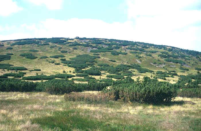
Is this a picture of two vegetation types that are intermixed, or one somewhat internally heterogeneous vegetation type? To map the vegetation in this image we would need to make a decision and define our cover type categories accordingly, but either choice is supportable on ecological grounds.
Once vegetation types have been defined your problems are not over, because ecological transitions ("ecotones") between vegetation types are rarely knife-edged. Consider this example:
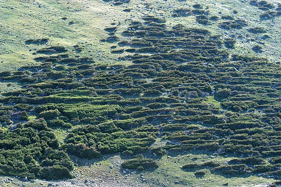
If we consider the shrubby vegetation to be one type and the grass to be another, where does one stop and the other end? Would you include the shrubs that are trailing off into the grass in the upper right corner to be part of the shrubs or part of the grass? Would a single, isolated shrub be a patch of the shrubby habitat? If a single shrub is not a patch, then how many would it take to become a patch? Likewise, when are the spaces between the shrubs big enough to be a separate patch of grass, and when are they just spaces between shrubs?
The examples above are not meant to frustrate and confuse you, they illustrate the basic problem in classification: ultimately, to map land cover we have to assign areas on the ground to cover types that we have defined, but classification imposes boundaries on natural features in which the boundaries are often fuzzy at best, and may not really exist at all. To some extent the cover types can be based on ecological criteria - for example, wetlands have very different functions and different species from the uplands surrounding them, and using a "wetlands" cover type is a good idea any time wetlands are found in your project area. However, in many instances the choices will depend on how we plan to use the cover type map. If we want to track changes in all the major wildlife habitat types found in our region, we would probably want to use an established wildlife habitat classification scheme, such as California's Wildlife Habitats Relationship System categories (you can find their system here). General schemes like this are not tailored to the habitat requirements of any single species of wildlife, but rather attempt to differentiate between habitats that tend to support very different ecological communities. A generalist species like a coyote will use many of the habitat types listed in the WHR system, and a specialist like the Cactus Wren will be restricted to a small number (such as coastal sage scrub and chaparral), but even within those general types they will only be found if large patches of cactus are also present within the habitat.
Similarly, if we were interested in monitoring plant communities, irrespective of how animals use them, we might use the California Native Plant Society's vegetation types (you can find their system here).
In contrast with these general approaches, we may only be interested in mapping habitat for a single species of plant or animal. In this case we would define our categories based on the particular needs of the species of interest, and for a species like the Cactus Wren we would only be concerned with whether the vegetated area had cactus in it. For a specific, targeted classification like this we might group all of the vegetated cover types that are used by our species into a cover type called "habitat", and all other vegetated areas that aren't used as "non-habitat". Similarly, if we were just interested in tracking human development activity we might be willing to have just two categories, "developed" and "undeveloped".
Generally what this means to us is that the cover type categories we use should be clearly defined, but also that the definitions of cover types we use should be devised to be useful for our purposes. Think of your cover type classification in the way you think about mathematical models of the real world - abstractions, simplifications, known not to be a perfect representation of reality at some level, but still useful.
The classes that we will use for this project are:
|
Cover type |
Definition |
|
Developed |
Any anthropogenic cover type other than agriculture (housing areas, shopping malls, roads) |
|
Agriculture |
Area used for crops, orchards, vineyards, or livestock |
|
Scrub |
Shrub-dominated vegetation |
|
Grassland |
Grass-dominated vegetation |
|
Forest |
Tree dominated vegetation |
|
Woodland |
Grasslands with scattered trees (primarily oak woodland in our area) |
|
Open water |
Water bodies |
|
Wetland |
Vegetation associated with water and saturated soils, including riparian areas and marshes. |
|
Bare ground |
Naturally barren areas, such as rock outcrops, or bare soil. |
As you learned in lecture, and experimented with in Lab 2, one way to map cover types is to hand-draw polygons around patches you see on the computer screen. This is a very good way of obtaining cover type data, in that it can be very accurate if the mapper is skilled at interpreting cover types from images (not an easy thing to do, by the way). However, it has several drawbacks:
The cost and time considerations are the least scientifically weighty issues, but they are not unimportant - conservation dollars are never over-abundant, and money spent on mapping habitats can detract from money spent buying land and managing habitats. Additionally, in rapidly changing landscapes a two-year manual mapping project will produce a map that is already two years out of date on the day it is completed. Particularly for change detection in a rapidly urbanizing area such as our own, automated approaches that can produce results in near real time have a lot going for them, even if they are prone to errors that a skilled analyst wouldn't make.
We will use a couple of approaches to cover typing LandSat data today, so that you can learn their strengths and weaknesses. ArcGIS supports both unsupervised and supervised classification, but really only supports one way of doing each one. There are many more possible methods than are included in ArcGIS, but we will focus today on the methods we have available in the software. Both seek to find spectral signatures (i.e. mean values of reflectance bands) that typify the land cover types present in the scene.
A schematic of the approach we will use is taken from the ArcGIS help file on image classification:
In the interest of time, we won't spend much time on step 1, data exploration and preprocessing. Just for your information, though, there are many different things that we could do to prepare the data.
We will want to compare cover types at two different time points, but we will deal with the issues above when we do the classification, rather than as pre-processing steps. Consequently, we will work with the raw DN's for our LandSat images.
Unsupervised classification looks easier than supervised classification based on the schematic, above, and it does involve fewer steps in the beginning. Since we don't specify the cover types in advance, there's no need to collect "training" data. Essentially, with unsupervised classification clusters of similar value across the bands used are discovered in the data, with the assumption that pixels from the same cover type will tend to have similar values across the bands, which are different from pixels that come from different cover types. Finding clusters of similar band values should be equivalent to finding different cover types. However, since we don't specify cover types in advance, we have more work to do after the classification is done to figure out what cover types are that these discovered clusters represent.
ArcGIS uses an "Iso Cluster" algorithm (algorithm means a process used to solve a problem) for unsupervised classification. Although you do not tell the iso cluster algorithm what the classes should be, you do have to tell it how many clusters to use. Typically the best strategy is to be conservative, and ask for more cover types than you would like to end up with, and then combine clusters that upon inspection prove to be from the same cover type but with slightly different spectral signatures. Once you specify the number of clusters to find, ArcMap assigns initial, arbitrary means for each class for each landsat band, distributed along the range of data to be clustered. For example, if we specified 10 clusters, and each band has values from 0 to 255, the first set of means for cluster 1 might be 25,25,25,25,25,25, the means for cluster 2 might be 50,50,50,50,50,50, and so forth. Each pixel is then assigned to a cluster based on its "Euclidean distance" from the cluster's means. Euclidean distance should be familiar to you, since you learned about it in your geometry class - it's the straight line distance between two points. With a single band, the distance between a pixel value and the mean for one of the clusters is just:

where B1p is the pixel value for band 1 and B1cm1 is the band 1 cluster mean for the first cluster. Squaring the difference and then taking the square root causes this to be a positive value, regardless of whether the pixel value is above or below the cluster mean. For two landsat bands, the formula is the same as the length of the hypotenuse of a triangle given the leg lengths, like you learned in geometry class. The formula is:

The squared distances between the pixel value and the cluster 1 means for band 1 and band 2 are calculated and the square root of their sum gives the distance. With more than two bands, we just continue to add squared differences between pixels and the cluster mean for the band. For the six LandSat bands we're using the distance would be:

This distance is calculated for every pixel for every set of cluster means (that is, each band for cm2, each band for cm3, etc.), and each pixel is assigned to the cluster it's closest to (that is, the cluster whose mean it has the shortest Euclidean distance from).
Once each pixel has been assigned, the means are re-calculated based on the pixels that are currently in the cluster, which are likely to be different from the initial arbitrary means. Distances between pixels and these new means are then calculated, and the pixels are re-assigned as needed. This process is repeated either until no pixel re-assignments occur, or until the number of "iterations" (number of repeats of the process) you specify has been reached. The greater the number of iterations the longer the analysis will take to complete, but the more likely you are to get reliable results that represent distinct clusters in the data.
1. Start ArcMap, and add the spring 2011 LandSat scene. We're going to use the 2011 data for our first foray into cover typing. Once ArcMap is open, add bands 1-5 and band 7 from the sp11 folder, which is in the Lab5 folder on the P: drive. We will omit band 6 because it has a different spatial resolution than the others (remember, Band 6 is the thermal infrared band with 120x120 m pixels).
2. Make a composite of the six bands. Make sure the bands are listed in order from band 1 at the top to band 7 at the bottom of the table of contents.
Then, open the Image Analysis window, and select all six bands. Click on the "Composite" button in the "Processing" tools (like last time). Don't worry about the assignments of bands to channels on the monitor, it won't affect the analysis we do (if it bothers you that the composite looks wrong, feel free to assign bands 3, 2, and 1 to red, green, and blue respectively - this is the natural color composite).
In the Table Of Contents, right-click on the composite that was created, open the Properties, and switch to the "General" tab - you can change the "Layer Name" to "spring11composite" and click "OK".
The layer naming bug makes it difficult to tell the bands apart (they are all called Band_1), but they are in the same order as they are listed in the TOC and Image Analysis window, so as long as you have them in order there everything will work fine.
3. Open the "Image Classification" toolbar. The tools that we'll use are all part of the "Spatial Analyst" extension, which adds imagery and raster data analysis functions to ArcMap. The functions that are specifically related to image classification have been collected into a handy little toolbar, which we'll make extensive use of today.
Position your mouse someplace over a blank area of the button bars at the top of the ArcMap window, and
right-click. Select "Image Classification" from the set of available toolbars. You'll see a new, floating toolbar
titled "Image Classification", 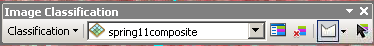 . If your spring11composite image is
not already listed as the active image, click on the dropdown menu and select it.
. If your spring11composite image is
not already listed as the active image, click on the dropdown menu and select it.
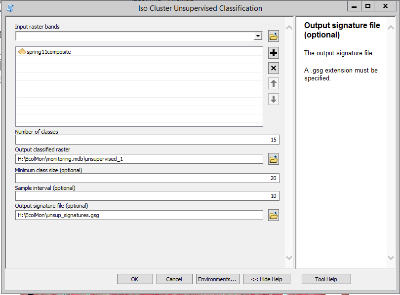
4. Generate the classified image and a signature file. Now we will conduct the iso clustering.
It might take a minute or two, be patient - as long as you're seeing the "Iso Cluster Unsupervised Classification..." progress indicator at the bottom of your map it's working. When it's done, the classified map will be displayed with 15 different color-coded categories, each named by a cluster ID number between 1 and 15. The color coding may be different, but it should look something like this:
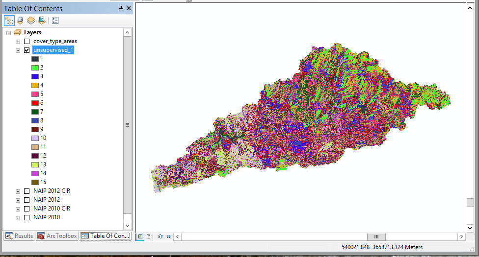
Now the hard part - figuring out what the cover type for each of the numbered clusters is.
You will need to be able to inspect each color on the map individually, so if you can't tell some of the colors apart you can change the color scheme by double-clicking on the name of the image, and then in the "Symbology" tab selecting a color scheme that has 15 colors that you can easily distinguish.
To figure out what the cover types are we will compare the clusters to high-resolution NAIP imagery.
1. Load the NAIP images into your map. Add the four NAIP layer files to your map (NAIP 2012.lyr, NAIP 2012 CIR.lyr, NAIP 2010.lyr, and NAIP 2010 CIR.lyr) from the Lab5 folder on P:.
You can also add the "cover_type_areas" shapefile - this is a set of 40 points I digitized showing examples of each of the cover types. You can open the cover_type_areas attribute table, click on "CoverType" to sort the cover type categories, select the rows that have a category you want to observe, and then zoom into the selected points on the map to see which of the unsupervised_1 colors they are in.
2. Re-arrange the table of contents, and set up swiping. Place your clusters in unsupervised_1 above the four NAIP images. Turn off every other layer but your clusters and the NAIP image you want to compare against. Zoom into the coastal Del Mar area, where the San Dieguito River runs into the ocean, at the western edge of the watershed polygon.
Turn on the NAIP 2010 layer (check the box next to it). Use the "Swipe Layer" tool in the Image Analysis window to swipe the unsupervised_1 layer. If you are trying to distinguish two categories that are both vegetated, turn on the color infrared version so you can see differences in near infrared reflectance. You can also turn off the 2010 images and turn on the 2012 images to make sure that the land cover is the same in the area you are observing for both years - if so, it's safe to assume it's the same in 2011.
3. Interpret the cover types. Now you have things set up, and you can figure out which of the nine cover types in the table above each of your categories represents.
Pick the low-hanging fruit first - open water is really easy to classify, because it doesn't look like anything else, so we'll use it as an example of how you will assign cover types:
 , to click on a pixel from one
of the water bodies in the map, and its category number will be reported as the "Pixel value". Find this number
in the table of contents.
, to click on a pixel from one
of the water bodies in the map, and its category number will be reported as the "Pixel value". Find this number
in the table of contents.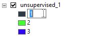 - note that the 1 is in an edit box -
you can type a new name for it now, so change it to "1 Water"
- note that the 1 is in an edit box -
you can type a new name for it now, so change it to "1 Water"Note that this didn't change the data in unsupervised_1, or the "Value" in the attribute table - changing the labeling in the TOC just helps you keep track of which cover types you've already identified.
You will complete these steps for all of the cover types in the map. Some suggestions:
Once you have identified each of the cover types we are using, find any of the categories in unsupervised_1 that don't yet have a cover type assigned and classify them. You can find where they are by right-clicking on unsupervised_1 and opening the attribute table, and then clicking on the row with the as yet unclassified category - this will select all the pixels of that category, which highlights them on the screen so you can zoom in on them for inspection.
You'll see that in some cases different land cover types get the same color in unsupervised_1 - bare ground is
hard to distinguish from areas that are covered with large buildings with reflective roofs, for example, and
forests and wetlands are hard to tell apart based on these six Landsat bands.
4. Double-check your cover types in other parts of the map. Now that you have identified cover types based on a few locations where the decision is relatively simple, look around the map and see whether your assignments of cover types are consistent across the map. For example, you identified open water in Del Mar, so make sure that it's correctly classified for Lake Hodges, and check that any areas classified as water in the map really are a water body. Likewise, if you classified a forest type in the high elevation mountainous areas to the east see whether that cover type is showing up in low elevation areas - if so, make sure that the areas near the coast with that cover type number also have tree cover (you may find some torrey pine woodlands close to the coast that you would like to have classified as forest, but you might also find that ornamental trees planted in housing developments get classified as Forest as well, when what you would like them to be is Developed).
5. Make a new layer that has been re-coded to your assigned cover types. You should now have all of the categories in unsupervised_1 identified as one of our nine cover types. Now that you know, for example, that several different signatures are all developed land, you will want to combine them all into one "Developed" category in a new map. But, the changes you made to the legend for unsupervised_1 just changed the labeling in the TOC, it didn't change the data. We now want to make a new raster layer in which the categories reflect our interpretation of the land cover types.
To convert your old cover type ID's to the new ones you assigned in your table of contents you just need to tell ArcMap what the old numbers are in unsupervised_1, and what new numbers will be assigned. Since the numbers are not very descriptive, we will also write down what the new cover types are for reference. We'll put this into a table in Excel for future reference.
Now you can make a final cover type map that uses the cover types you assigned:
When you're done you should have your new cover_spring11 map displayed, with just the nine cover types we wanted to map instead of the 15 clusters found in the unsupervised classification.
As you were working through this you should have seen a few things that could be issues with this method of cover typing:
It's possible to address these issues to an extent by using other kinds of data that supplement the imagery - things like "digital elevation models" that give the elevation at every pixel, and can be used to get slope and aspect as well (slope being the steepness, and aspect being the direction the hill is facing) can help tell the difference between different vegetation cover types. Maps of soil types can also help. Pixel-level differences may not be very distinct when 30 x 30 m pixels are used, but may be more clear when combined with higher-resolution images, or possibly even with coarser resolution (a coarser resolution may help tell the difference between development and open areas, such that naturally bare ground may be differentiated from rooftops). Using data from different seasons can also help, since natural vegetation is green during the wet season but dries out in the dry season, whereas developed areas are often watered and stay green during the dry season. It is also possible to develop measures of texture by looking at patterning of pixels in the vicinity, which can help tell the difference between things like grasses and shrubs.
And, another approach to classification can be attempted, called supervised classification. At this point, the required part of the assignment for the undergrads is done, but if you are interested in seeing how a different approach that uses the same data can give a different cover type map, feel free to proceed (for the grad students this next part of the exercise is required).
Supervised classification differs from unsupervised classification in that we specify the classes we want to map in advance. We give ArcMap a set of polygons with known cover types, and it creates spectral signatures from them. It then classifies the rest of the unknown pixels in the map based on which of the known cover types the pixel is most similar to in its band values.
The biggest advantage of supervised classification is that we can be certain that the cover types that we're interested in will show up in the final set of cover types, and we don't need to inspect the cover types to figure out what they are. The biggest disadvantage is that it's really easy to define a heterogeneous cover type that include pixels with really different spectral values. The problem with this is that when the pixels are averaged together to make the spectral signature for the cover type, the averages will be between the signatures for these very different pixels, possibly to the point that the pixels that belong to the cover type will be closer in signature to other cover types than to their own. Think, for example, of the wild mix of cover types that were assigned to "Developed" when you did your unsupervised classification. You probably found that some of those pixels were dominated by ornamental trees, and looked like forests. Some were dominated by manicured lawns, and looked like wild grasslands. Some were dominated by streets and houses, and looked completely different from the ornamental trees and lawns around them. When we average together the pixels with ornamental trees, lawns, houses, and streets together the means may not be very close to most of the pixels that make up the cover type. When we go to classify unknown pixels the ornamental trees may end up closer to natural forests, the manicured lawns may end up closer to grasslands, and the houses and streets may end up closer to bare ground or rock outcrops.
We could address this problem, if we know of it in advance, by intentionally using more categories initially than we need - we could start with a category for "ornamental plants" and a separate one for "buildings", and then lump them together into a single "Developed" land cover type later, like we did with the unsupervised approach. But, as a learning exercise, we are going to try to use just the nine categories we want at the end, and we'll see how well the supervised approach deals with the heterogeneity in some of the categories.
Training data are data points or areas on the map of known cover type, which are used to develop spectral signatures. ArcMap can use training data defined by points, lines, or polygons, which it overlays with the LandSat data to select the pixels that overlap with them, and then averages the pixels in each band to get the spectral signatures for each cover type.
Training data can come from field sampling - one can go out into the field with a GPS, stand in the middle of one of the cover types (like a housing development, or a forest, etc.), and record both the coordinate and the cover type. This can be an excellent way to generate training data for cover types that are easy to identify on the ground, but difficult to identify from imagery - forest types that differ in the mix of tree species that compose them are notoriously difficult to distinguish from an air photo without a great deal of training and experience, but are much easier to tell apart on the ground.
For our purposes, we will generate training data from ArcMap. We'll use our NAIP images to find a selection of areas of each of the cover types we want, and draw polygons around them. We will then use the polygons to average the pixels in the LandSat bands to derive signature files. Finally, we'll use the signature files to classify the rest of the pixels in the map into cover types.
1. Prepare to begin. Turn off everything except the 2012 NAIP image. Zoom to the coastal Del Mar area again.
2. Identify the first cover types for the training data set. To get our training samples, we need to do the following:
3. Move on to the other categories that you identified in your final unsupervised classification map. When you're done you should have just one row for each of the final categories that you want. You may need to zoom to other regions of the map to find some good spots - you can use the "cover_type_areas" layer to find a selection of them. Make sure the polygons you draw are inside of the area we have LandSat data for - you can turn on spring11composite to double check where the data set's boundaries are.
4. Check the statistical distributions of the pixels. The classification algorithm works best when a) the distribution of the training data is normal, and b) when there is good separation in spectral signatures between groups. Of the two, the second is by far the most important, since overlap among the signatures means that the cover types can't be distinguished by their spectral signatures.
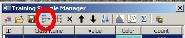
5. Generate the signature file. First, make the "Value" numbers in the Training Sample Manager match the ones you used for your unsupervised map - the "Value" is all that will be written to the cover type map, so it's good to do this to make it easier to match the codes in "Value" with the cover type names later on. It will also make comparison between supervised and unsupervised maps easier.
Click on the "Create a Signature File" button (above the "Count" column of the training samples manager), and save the file to your S: drive. Call the file "training_sp11.gsg". The signature file will save means for each band for each cover type, and a covariance matrix for each cover type as well. The covariance matrix is used to help improve the assignment of pixels to cover types, so let's take a brief statistical detour to see how.
Covariance is related to correlation, and you should recall that correlations are measures of association between two variables that can have any decimal value between -1 and 1 (negative correlations indicate that an increase in one variable is accompanied by a decrease in the other, and a positive correlation means that an increase in one is accompanied by an increase in the other). The formula for correlation can be written as:
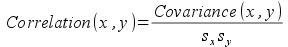
where sx and sy are the standard deviations for the two variables. Covariance is a measure of the average cross-products between two variables (that is, the distance of a data point from the x-variable mean multiplied by the distance of the data point from the y-variable mean):
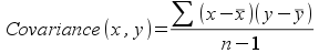
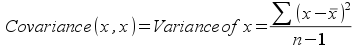
From this hopefully you can see that correlations are a kind of standardized covariance, in that dividing the covariances by the standard deviations is what causes the correlation to be bounded between -1 and 1. Conversely, covariances are raw measures of the tendency of variables to increase or decrease relative to one another in a consistent way. Correlations don't have units, but covariances have the units of the product of the two variables, and covariances are not bounded between -1 and 1. If you calculated the covariance between a variable and itself, you would be multiplying the difference between a data point and its mean by itself, yielding the square of the difference. The covariance between x and x would then be the variance of x:
A covariance matrix is the set of covariances between pairs of variables. An example might look something like this:
| Band 1 | Band 2 | Band 3 | Band 4 | Band 5 | Band 7 | |
| Band 1 | 154.5 | 88.3 | 118.6 | -17.2 | 61.1 | 71.6 |
| Band 2 | 88.3 | 55.2 | 75.5 | 2.3 | 54.6 | 51.6 |
| Band 3 | 118.6 | 75.5 | 110.6 | 2.3 | 89.9 | 82.6 |
| Band 4 | -17.2 | 2.3 | 2.3 | 174.2 | 121.5 | 28.7 |
| Band 5 | 61.1 | 54.6 | 89.9 | 121.5 | 277.6 | 146.7 |
| Band 7 | 71.6 | 51.6 | 82.6 | 28.7 | 146.7 | 109.4 |
The rows and the column labels are the same, they are the set of six bands we will use in our cover typing. Every cell in the table for which the row and column name is not the same is the covariance between the variables. Every cell for which the row and column names are the same is the variance for that variable. Since the rows and columns are the same, each pair of variables shows up twice, once above the "main diagonal" (which is where all the row and column names are the same, running upper left to lower right), and once below the main diagonal.
You can see from this, for example, that most of the variables are positively related, meaning that an increase in radiance for one band is associated with an increase in radiance for the other. The only exception is the relationship between band 1 and band 4, which is negative (an increase in band 1 is associated with a decrease in band 4).
Why is this important? The pixels will be assigned based on which cover type they are most likely to belong to (the "Maximum Likelihood" criterion). We have six different bands that we are working with, but let's just consider two for the moment so we can envision what's going on better. The probability that a pixel belongs to a cover type depends on the means on both of the bands, and on the variance around the means. As you know, a normal probability distribution for a single variable is "bell-shaped", so what would a normal distribution for two variables look like?
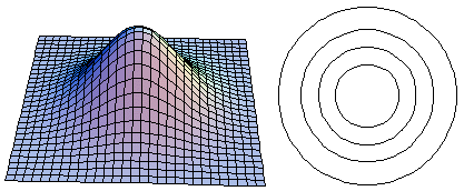
On the 3-d graph on the left, the x- and y-axes are each a LandSat band, and the height is the probability of observing a particular x,y pair. The 2-d graph on the right is a plot of concentric circles, and for each one the edges of the circle have equal probability (like a topographic map), with the outer circle having the lowest probability, increasing as you move inward. If you drew a line around the 3-d graph at a constant height and then looked down on it from above, you would get the 2-d graph on the right. When the x and y-axes are not correlated you will get concentric rings like this, that are not up or down. Note that the 2-d graph may look elliptical if the x- and y-axes are not plotted with the same units, but even if the shape is elliptical it will not be tilted up or down if the variables have a correlation of 0.
Compare the uncorrelated case with the case in which x and y are strongly positively correlated, as below:
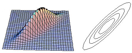
The positive correlation means that high values of band 1 and band 2 are likely, and low values of band 1 and band 2 are likely, but high values of band 1 are unlikely to accompany low values of band 2, and vice versa.
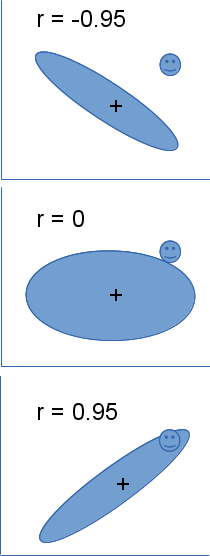 The correlations have a big effect on classifying our unknown pixels. Consider the example to the left - the
ellipses in the three different panels represent the outer ring in our 2-d graphs above, showing the distribution
of the training data on band 1 and band 2 for one of the cover types. The plus in the middle of the ellipse is the
mean on x (band 1) and y (band 2), and is in the same location in all three panels. The happy face in the upper
right is a pixel for which we would like to calculate probability of belonging to this cover type, and it too is
in the same location in all three panels. If only the means were important, and the covariances didn't matter,
then the unknown pixel would always either be assigned to the cover type or not.
The correlations have a big effect on classifying our unknown pixels. Consider the example to the left - the
ellipses in the three different panels represent the outer ring in our 2-d graphs above, showing the distribution
of the training data on band 1 and band 2 for one of the cover types. The plus in the middle of the ellipse is the
mean on x (band 1) and y (band 2), and is in the same location in all three panels. The happy face in the upper
right is a pixel for which we would like to calculate probability of belonging to this cover type, and it too is
in the same location in all three panels. If only the means were important, and the covariances didn't matter,
then the unknown pixel would always either be assigned to the cover type or not.
You can see that when the correlation between the two bands is negative the unknown pixel falls well outside of the ellipse - the probability that the pixel belongs in that cover type is going to be pretty small. When there is no correlation the unknown pixel is slightly outside of the ellipse - the unknown pixel has a moderate probability of belonging in that cover type. Finally, when the correlation is positive the unknown pixel easily falls inside of the ellipse, and is likely to be of that cover type.
Although the graphs show correlations to make the interpretation easier, variances and covariances are actually used in the probability calculations. The covariance matrix is included in the signature file so that this effect can be included in the classification process.
So, to summarize, accurately assigning pixels to cover types depends on knowing not only the means but variances and correlations (and thus covariances) as well. The effect is the same when you have 6 bands instead of 2, but 6-dimensional graphs are hard to draw.
6. Classify the unknown pixels. Now that you know how this is working, you can go ahead and classify your cover types. From the "Image Classification" toolbar, drop down "Classification", and select "Maximum Likelihood Classification". The spring11composite should already have been included as the input raster band, but if not add it.
Next, enter the "training_sp11.gsg" signature file you just created in "Input signature file".
The output classified raster should be called "supervised_sp11", and should go into your monitoring.mdb database.
The rest of the options can stay at their default values. Click "OK".
When it's done, the cover type map should be automatically added to the table of contents.
7. See if it worked. We will work next week on quantifying accuracy, but for now compare the new cover type map to the NAIP imagery and see how it looks. Specifically, look at a couple of things:
And that's all for today! Save a map file, but the rest of your work should be in monitoring.mdb on your S: drive already.