Spreadsheets as Swiss Army Knives

Excel is the spreadsheet program produced by Microsoft. Spreadsheets are extremely versatile tools for managing, graphing, and analyzing data. Nearly anything you would want to do with data can be done with a spreadsheet. Spreadsheets are also relatively easy to use, compared to other options available.
However, the versatility of spreadsheets comes at a cost. More specialized tools exist that can do each of the things that Excel does better than Excel.
For example, we will be using Excel to enter and manage data. Database management programs (such as Microsoft's own personal database program, Access) can store larger data sets more efficiently, and allow users to interact with data with less potential for data loss or corruption.
We will be using Excel to graph data. There are dedicated graphing programs (like SigmaPlot) that can produce a much larger range of graphs, and can handle plotting of grouped data much better than Excel.
We will be using Excel for statistical data analysis. There are better statistical analysis programs (like MINITAB and R) that are faster, support specialized types of analysis, and offer graph types that support statistical data analysis better (such as normal probability plots and histograms).
We will use Excel for numerical analysis. There are better programs for numerical analysis (such as MatLab) that are faster and more efficient than Excel.
We will use Excel to write a genetic drift simulation model. There are programming languages (like C++ and Python) that will run a simulation much faster than Excel.
But, none of these specialized tools can do all of these functions as simply as Excel. Because of its versatility, no matter what you do when you leave CSUSM, if your career is at all related to the biological sciences you will almost certainly encounter Excel on the job.
Basic anatomy of a worksheet
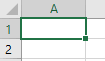
In a spreadsheet program like Excel, data is entered into a worksheet, that is made up of a grid of cells organized in rows and columns. You can refer to a cell in the worksheet by its row and column index - columns are indexed by letters at the top of each column, and rows are indexed by numbers to the left of each row. Cell A1 is selected in this screen shot.
The formula bar is the blank area above the columns, starting at column D. The selected cell contents will appear and can be edited here. As you will see, sometimes what shows in a cell is the result of a calculation, and if you select the cell the formula will appear here while the cell itself displays the result of the calculation.
If you hover over the formula bar, column index letters, row index
numbers, or cells in the worksheet a tooltip will pop up to identify it.
Basic anatomy of Excel's interface
Much of Excel's functionality can be accessed through its ribbon interface. This is the name for the grouped sets of buttons along the top of the Excel window. Sets of buttons are grouped by type of operation, with a label below identifying the button group. Buttons are further grouped into named tabs by task - the tabs are File, Home, Insert, Page Layout, and so on. By default when you start Excel the Home tab is selected, and the buttons available are shown here:
Button groups that are important to us will pop up a tooltip explaining what they are for as you hover over the picture above. The "clipboard" group has buttons that handle copying and pasting operations, the "font" group has buttons for all things related to styling and coloring text, and so on.
If you click on the next named tab, "Insert", you'll see a different set of buttons.
Buttons on the "insert" ribbon handle inserting (among other things) PivotTables and graphs. We'll use graphs later this semester, but today we will focus on PivotTables, which are a powerful tool for summarizing data. To make use of PivotTables, we need to use a particular data organization called "stacked data". We'll learn what that means now.
Data organization
Spreadsheets give you a great deal of flexibility in choosing how to organize your data. One consequence of this flexibility is that Excel provides you with no guidance about organizing data to make it easy to manage and analyze. Although any number of ways of entering data are possible they are not equally good, and choosing a good data organization makes the rest of your work much easier.
For example, we will (shortly) be working with some measurements made on leaves picked from a tree, and from leaves picked up off of the ground. The example to the right shows six measurements of masses of leaves in each group, and color is used to indicate whether they are taken directly from the tree or from the ground. Hopefully it is obvious that this example is a particularly bad choice for a data organization scheme (in fact, it is probably an overstatement to call it an "organization" scheme at all). The color coding makes it possible to see which numbers are from which group, but trying to do any sort of analysis on these data would be difficult. This isn't meant to be a realistic option for data entry, but rather it's an illustration of the fact that because Excel lets you enter your data any way you want it is possible to get it very wrong. |
We can improve on the chaos of the first approach by grouping the data together into blocks, grouped by the source of the leaves, and ditch the color coding. We can then label the two different sets of data in a nearby cell to make it clear what each block of data represents. This looks a little bit better - it's certainly less chaotic - but think about why it looks better. First, having the data values belonging to each group entered in a contiguous block makes it easier to see the values all at once, and to compare them. Comparison is a fundamental operation in the sciences, and having data organized in a way that comparisons between groups can be easily made is always a good thing. If you wanted to take an average of each group it wouldn't be difficult. We will learn more about spreadsheet formulas in a couple of weeks, but for now it's enough to know that we can calculate an average by identifying a range of cells that contain the numbers, and having them all together in a block makes that easy to do. But, you may be surprised to find out that this is only slightly better than the chaos method when it comes to managing and analyzing data. The disadvantage of this method is that it doesn't make good
use of the rows and columns. As you learned in biostats,
scientists collect data by defining variables
as measurements of specific properties of some component of a
system we're studying. We also need to replicate our
measurements, which means that we use more than one experimental
subject, and measure the variables we are using on each subject.
When we have data from a variable that we want to enter into a
worksheet, we can make use of the rows and columns to help us
keep track of what variable the data represents, and what
individual subject the data pertains to. |
A better alternative to entering the data in blocks is to use an unstacked organization. In this organization, a column is used to hold all of the data from leaves on the ground, and another is used for all of the data from leaves on the tree. You can see that the columns are labeled, and the labels identify two different variables - one identifies what the numbers represent (mass), and the other identifies the level of the grouping variable that each column belongs to (categorical variable "type" with levels "ground" or "tree"). This is one of the two common organizations used for statistical data analysis - you might recognize it from biostats, because it was one of the two data organization types that were supported by MINITAB. It isn't the one that I recommend, though. The primary problem with the unstacked approach is that while it uses columns to indicate the groups that the leaves belong to, the rows don't carry any meaning. For example, the first row of data (in row 2 of the worksheet) has a 0.4 for the mass of the first leaf from the ground, and 4 for the first leaf from a tree, but there is no reason for these two leaves to be sitting next to each other - the measurements are from two different leaves, and they aren't paired in any way, so we could rearrange the numbers in column A while leaving the values in column B alone, and it wouldn't matter. Consequently, the fact that these two leaves are in the same row tells us nothing useful. This isn't a problem if the only thing we wanted to know about these leaves is how much they weighed, but we may have multiple pieces of information that we want to record about each leaf. If we had data on both the mass of each leaf and the length of each leaf, how would we add the length information in a way that made it clear which measurements were for the same leaf? |
The data organization in which both rows and columns are meaningful, and that I thus recommend, is stacked data. You can see an example to the right - now each column is a different variable (with mass in column A, and the leaf type, which is either tree or ground, in column G), and each row is a single leaf. Both the row and column that a data point is in carries information now - the row identifies which leaf the measurement is from, and the column identifies the variable. One of the huge advantages of stacked data is that it is the most flexible, easiest organization method for analysis of data in Excel. When data sets are organized this way it's possible to take advantage of data analysis features like sorting, filtering, and (most importantly) PivotTables. |
The take-home message is this: When you used MINITAB in biostats, each column had to be a variable type (either numeric or text), and you were limited to using either an unstacked or a stacked organization - chaos was not an option. In that way, MINITAB's lack of flexibility prevented you from using a data entry scheme that would cause you problems. Excel doesn't prevent you from using data entry schemes that you will regret, so you will need to choose a good approach on your own. I recommend using stacked data.
Exercise - entering data, extracting data, re-arranging data, summarizing data in Excel.
Before you get started, create a folder called "biol365" at the root of your H drive. Within that folder, create a folder called "ex1". It's very important that you set this up correctly to make sure the instructions for these exercises work for you.
Download this file, called "leaf_data.xlsx", to your h-drive (in folder H:/biol365/ex1). Make sure you save the file first! If you open in Excel before you save it, you may have problems (possible software crash, difficulty finding your work later after you've saved it, etc.). The file contains measurements of several variables from 103 sycamore leaves that were either collected from the ground, or picked live from a tree.
If you open the file in Excel, you'll see that it is organized as stacked data. Each row is a single leaf, and each column is a variable measured. The names of the variables are mass, petiole.diam (diameter of the petiole in mm - the petiole is the small stem that attaches the leaf to the branch), max.vein.len (length of the longest vein in mm), num.veins (a count of the number of veins in the leaf), leaf.thick (thickess of the leaf in mm), max.width (width of the leaf at its widest point, in mm), and type (T for leaves picked from the tree, and G for leaves collected from the ground).
As you work through the exercise, bear in mind that undo is your friend! The left-curved arrow, ,
at the upper left corner of the window is the "undo" button (the
right-curved arrow is the "redo" button). If you make a mistake (such as
deleting something you didn't mean to, or sorting something incorrectly)
you can click the undo button and most of the time you can reverse your
mistake. Clicking the button will undo the most recent operation, and
clicking repeatedly will undo in the order that you executed the
operations. Clicking and dropping down the undo list allows you to select
a particular operation to undo, out of order.
,
at the upper left corner of the window is the "undo" button (the
right-curved arrow is the "redo" button). If you make a mistake (such as
deleting something you didn't mean to, or sorting something incorrectly)
you can click the undo button and most of the time you can reverse your
mistake. Clicking the button will undo the most recent operation, and
clicking repeatedly will undo in the order that you executed the
operations. Clicking and dropping down the undo list allows you to select
a particular operation to undo, out of order.
A. Filtering and extracting data
We are going to start today by learning some of Excel's features that help you enter and manipulate data. We'll start with filtering.
1. Turn on
auto-filtering. Select one of the headings (any one, like
"mass" in cell A1), and click and hold "Sort & Filter" on the right
side of the button bar - when the menu drops down select "Filter" (like
this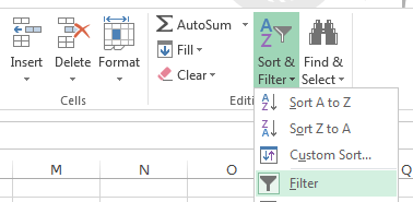 ). You'll see
that this puts a drop-down menu button on each of the column headings in
the data set. As long as all the data are contiguous (meaning, no blank
rows or columns) Excel will find all the variables and turn filtering on
for all of them.
). You'll see
that this puts a drop-down menu button on each of the column headings in
the data set. As long as all the data are contiguous (meaning, no blank
rows or columns) Excel will find all the variables and turn filtering on
for all of them.
2. Filter the leaves picked from the tree. Click on the down-arrow on the "type" variable (in cell G1) - you'll see that all the unique values in this column are identified (T, G), with a check box next to each of them. Un-check the box next to G, so that only T is selected, and click "OK". You'll see that only the T leaves are showing. To help you remember that you're filtering the data, the icon in the drop-down menu box has changed to show a filter icon, and the row numbers have turned blue and are no longer sequential numbers - they still represent the row numbers from the entire data set, but the rows with G leaves are hidden.
This is just a temporary change to how the data are displayed, and everything will be back to normal when you turn filtering off. If you want to extract the data for T, you can select all the cells, copy, and paste to a new worksheet. To do this, you will need to:
- Select all the cells, right-click, and select "Copy".
- Make a new worksheet by clicking on the + next to the "Sheet1" tab at the bottom of the worksheet - it will be called Sheet2.
- Select the upper-left cell of Sheet2 you want to paste to (A1), right-click and select "Paste".
Selecting cells
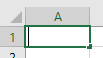
This is a good time to double-check that you know what it means to "select" a cell in Excel. Selecting a cell is done by clicking once, with the left mouse button. A selected cell looks like this:
A selected cell has a thick line around it, with a small square in the lower right called the "fill handle" (which we will make use of shortly).
Sometimes the mouse you use only has one button, and if so it acts like a left button on a two-button scroll wheel mouse like the ones we have in the computer labs. Left-clicking is much more common an operation than right-clicking, so if the instructions only say "click" assume they mean "left click".
If you double-click on a cell, it changes its appearance to this:
Hopefully you can see that there is a thin vertical line at the left side of the cell - this indicates that the cell is activated for editing. You don't need to double-click an empty cell to enter data into it, you can just select it and start typing. However, if a cell already contains something you need to double-click to edit its contents, or your typing will replace what is already in the cell. If you accidentally enter editing mode, you can get out of it by hitting the ENTER key (if you haven't made any changes), or by hitting the "ESC" key or by clicking on the red X next to the formula bar,
, if you accidentally made a change and don't want it saved in the cell (it doesn't turn red until you hover over it).
When the instructions tell you to "select" a cell, they mean that you should left-click into it once. What you are able to do with a cell depends on whether you have selected it or activated it for editing, so it's important not to do one when you mean to do the other.
For example, you can select more than one cell at a time by (left) clicking on the first cell you want to select and holding the button down, then dragging either up, down, right or left to extend the thick line to include additional cells, and then releasing the button. This only works with selecting - if you have activated the first cell for editing, you will not be able to select additional cells before getting out of editing mode.
Pointer types
Excel has a huge set of features, so much so that if Excel's interface presented everything it could do all at once it would become difficult to find the features that you need for the particular task at hand. One of the ways that Excel tries to address this problem is by presenting features only when they are needed - that is, what Excel presents to you depends on the context. We will see this frequently throughout the semester - you will see different options when you right-click on a cell in your worksheet than when you right-click in a graph (the menu that pops up is even called a "context menu"), and the tabs in the ribbon interface will change when you select a PivotTable or a graph.
The other thing that depends on context is the pointer type. When you are moving your mouse around over the ribbon, or anywhere outside of the worksheet cells, the pointer will look like this:
- this pointer is used to select menu items, or to click on buttons in the ribbon.
When you move your pointer over the cells in the worksheet, it changes to this:
- this pointer is used to select a cell (with a single click) or activate it for editing (with a double-click).
If you hover over the thick line around a highlighted cell (anywhere but the fill handle) the pointer changes to this:
- this pointer can be used to move a cell, including its contents, to another location. If you click, hold, and drag with the left mouse button on the edge of a cell or a range of cells they will be moved to the location where you release the button.
Last for now, if you hover over the fill handle the pointer looks like this:
- with this pointer, if you click/hold/drag the fill handle you can either copy the contents, or create a series into the cells you drag over.
3. Filtering by numeric values. Switch back to the full data set in Sheet 1. Next we will filter petiole diameter to only show diameters bigger than 3. If you drop down the filter menu for petiole diameter, you'll see that you get a list of unique numbers in the column, sorted in numeric order. You could un-select all of them that are less than 3, but as the data set gets large and the number of different values increases this approach becomes too time consuming.
Instead, select "Number filters" → "Greater than or equal to", and enter 3 for the value. Since the leaf type filter is still in place, you are now seeing the T leaves with petiole diameters greater than or equal to 3.
Copy the data, make a new sheet (Sheet3), and paste the data there.
Switch back to Sheet1, and clear the filters selectively from petiole.diameter by selecting "Clear filter from petiole.diameter" from the drop-down menu.
Turn off filtering by selecting "Sort & Filter" and clicking on "Filter" again - this is a toggle, meaning that selecting it when it's off turns filtering on, and selecting when it's on turns filtering off. With filtering turned off all the data are displayed, in the original order.
B. Proper use of the "fill handle" and the "fill" menu.
Now we are going to sequentially number the leaves in each group, which will help us when we re-organize the data in the next step.
4. Sort by type. We want to sort by leaf type so that we can easily number the leaves within each group. But before we do this you should know that...
SORTING A SPREADSHEET IS DANGEROUS
Another problem with Excel's flexibility in data entry is that you have the ability to make big, costly mistakes with little or no effort.
One of the quickest ways to irretrievably screw up your entire data set in Excel is to sort it incorrectly. For example, rows represent measurements from a single leaf, and if you sorted the leaf thicknesses without sorting the rest of the columns, you would scramble the data. If you didn't realize you did this, saved your work, and closed Excel, all "undo" information is lost and you would be unable to recover the original sort order. Worse yet, mistakes like this can be very difficult to detect - it doesn't change the data values, just the relationships between the variables - so you may never realize your data are all wrong.
Excel knows this is a danger, and tries to help you - if you select part of a contiguous set of data and try to sort it, Excel will pop up a warning and ask if you want to extend the selection to include all of the contiguous data. You can take advantage of this to speed up your work - if you select just a single cell in a contiguous block, Excel assumes you want to sort the entire contiguous data set and will select it for you.
So, to avoid problems, make sure your data are contiguous - that is, no blank columns. The data we are working with is contiguous, so we won't have a problem, but you've been warned!
The other sort problem we have to be careful about is that unless we have a column that indicates the original sort order we won't be able to get back to the original order after we save and quit. Sometimes the original order of the data is important - the data may have been collected over time, for example, and it may be important to know the order that the data were observed. We will start by adding an "original order" column that shows how the data were sorted when we opened the worksheet - no matter how we sort the data, we can always get it back to the original sort order by sorting on this column.
5. Make an "original order" column for safety, using the fill handle. Enter "Original order" in column H1.
In cell H2 enter a 1. After you hit ENTER you will be in cell H3, so select H2 again.
The little black box in the lower right is called the "fill
handle", 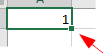 , and it
does different things in different contexts. If you left-click, hold,
and drag the handle down it acts as a copy/paste (go ahead and try this
- fill down a few cells and you'll see you have 1's in each cell you
filled into).
, and it
does different things in different contexts. If you left-click, hold,
and drag the handle down it acts as a copy/paste (go ahead and try this
- fill down a few cells and you'll see you have 1's in each cell you
filled into).
Now, change the number in H3 to 2. Select both cells H2 and H3,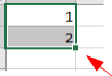 . If you now double-click on the fill handle
you will see that you now have sequential numbers from 1 to 103 in
column H, indicating the current (original) sort order. Excel
interpreted the two cells you selected as the start of a numerical
sequence and it extended the sequence to the last row of data in the
adjacent column G.
. If you now double-click on the fill handle
you will see that you now have sequential numbers from 1 to 103 in
column H, indicating the current (original) sort order. Excel
interpreted the two cells you selected as the start of a numerical
sequence and it extended the sequence to the last row of data in the
adjacent column G.
6. Sort by leaf type. To sort by type, just select cell G1, drop down "Sort & Filter", and select "Sort A to Z" (that is, alphabetically, or in increasing numeric order). If you watch as this happens, you'll see that Excel very quickly expands the selection to the entire data set, and sorts the entire data set by leaf type - the rows are all intact, they are just ordered by type.
7. Enter sequential leaf numbers, using "fill series". Enter the column heading "leaf.number" into cell I1.
We could use the same trick as we used before, but sometimes it's inconvenient to use the fill handle (if there are thousands of rows, for example). In this case we want to be able to number the leaves sequentially for each group from 1 to n, where n is the number of leaves in a group. We can create sequential numbering for a whole set of selected rows, which will work better for this task.
Enter a 1 in cell I2, and then select all the cells from I2 to I53 (which are the rows that have G leaves).
Next, select "Fill" → "Series" from the ribbon - it's just to the left
of Sort&Filter and it's labeled "Fill" if you have Excel at full
screen. If not, it will look like this:  .
.
In the window that pops up, the default settings of a "Linear" type, with a "Step value" of 1 will give us sequential numbers, so click "OK".
Repeat this for T leaves (enter a 1 in cell I54, and fill the series to the last row).
8. Sort the columns from left to right alphabetically. We don't really need to do this, but just so you know how...
- Click into a cell in the data set (anywhere with data in it), and then click on "Sort & Filter" → "Custom sort". In the dialog that pops up, you'll see that you can select a "Sort by" column, and then can "Sort On" either the data values in the cells (the default), or by formatting information. Excel's default assumption is that you want to sort rows, so these options are all selected to allow you to pick column labels. We don't want to sort rows this time, so ignore all these settings for the moment.
- Click on "Options" and select "Sort left to right", and then "OK".
- Now, back in the Sort settings everything is set up for sorting columns based on the values in one or more row. To sort the columns alphabetically by column label:
- Select "Row 1" for the "Sort by" selection, and leave the rest at default values.
- Click "OK".
You'll see that the columns are in alphabetical order.
C. Using Pivot Tables to summarize your data.
Excel's PivotTable is a tool for summarizing stacked data sets. Once you learn how they work, you'll see that PivotTables are an easy, convenient way to summarize complex data sets.
9. Construct a Pivot Table. We will use Pivot Tables today to calculate the sample size, average, and standard deviation of mass for each leaf type.
a. Make sure you're in Sheet1,
and select any cell in the block of data, activate the "Insert" tab, and
click on PivotTable ( like this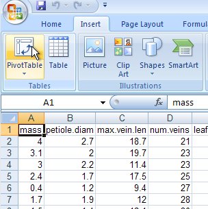 ).
).
b. You will see the Create
PivotTable dialog pop up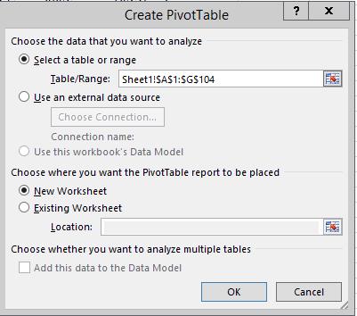 ,
and you will see that it has successfully found your data and identified
it in "Table/Range:". The format of this entry is Sheet1!$A$1:$I$104.
This is saying that the data are in Sheet 1, with the upper left cell
found in cell A1, and the lower right cell found in I104. We will learn
about the meaning of the dollar signs later this semester, but for now
ignore them - they don't change the fact that the cell references are A1
and I104. If you look at the data still visible behind the Create Pivot
Table window, there is a dotted line around the data that indicates what
the Pivot Table will be using.
,
and you will see that it has successfully found your data and identified
it in "Table/Range:". The format of this entry is Sheet1!$A$1:$I$104.
This is saying that the data are in Sheet 1, with the upper left cell
found in cell A1, and the lower right cell found in I104. We will learn
about the meaning of the dollar signs later this semester, but for now
ignore them - they don't change the fact that the cell references are A1
and I104. If you look at the data still visible behind the Create Pivot
Table window, there is a dotted line around the data that indicates what
the Pivot Table will be using.
Having found the data you wish to summarize, you now need to decide where to put the summary table - by default Excel elects to create a new worksheet, which is what you want here. Select "OK" to create the table.
c. Now you can construct the
table. You should be looking at a new worksheet (Sheet4), with a blank template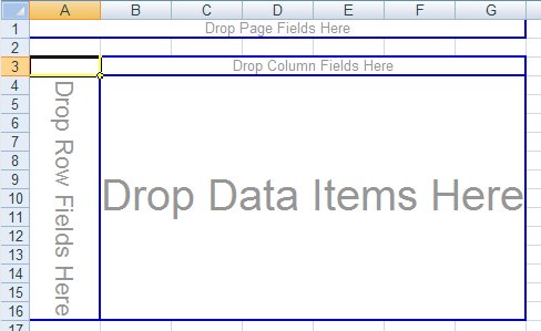 for your table to the left, a list of the column names in your data
range to the upper right
for your table to the left, a list of the column names in your data
range to the upper right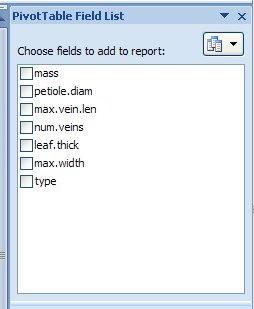 ,
and a set of possible places to place the variables in the table in the
lower right
,
and a set of possible places to place the variables in the table in the
lower right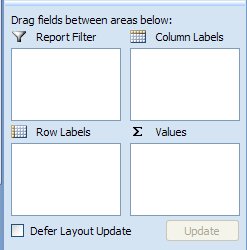 .
.
The simplest way to construct the table is to drag the names of the variables you wish to use from the Field List into the blank template - in computer science a "field" is a column in a table, so the PivotTable Fields list is a listing of all the columns in your data set. The variable "type" is your grouping variable, so drag it from the field list and drop it into the "Drop Column Fields Here" bar in the template. You will see that the two leaf types present in the data are now showing as column labels (T and G).
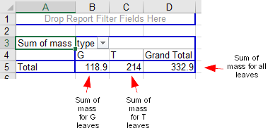
You wish to calculate mean and standard deviation of mass, so select "mass" and drag it to the "Drop Value Fields Here" area. You will now have summarized data, and by default Excel picks a sum as the statistic to report for numeric data. It looks like this:
The layout is fine, but the statistic is wrong, so double-click on "Sum of mass" in the table and change "Sum" to "Average". It will now look like this:
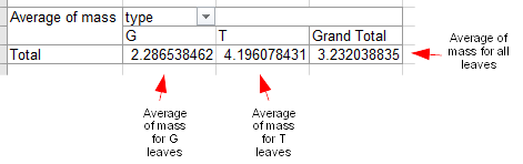
You'll see a funny quirk of Excel pivot tables at this point - the row and column labels still say "Total" and "Grand Total" respectively. These are not totals (which imply a sum), they are averages, but Excel doesn't change the labeling when the summary statistic changes.
Now we will add a standard deviation. Once again drag "mass" from the list of fields over to the pivot table, and drop it on top of the averages of mass. You will see that Sum of mass is now sitting next to Average of mass beneath each leaf type label. Double-click "Sum of mass" and change "Sum" to "StdDev" (not StdDevp, which is the population standard deviation - you will probably never use this option, as you will always be dealing with samples of data).
When you dropped mass into the value fields for the second time, you may have noticed that the "Column Labels" block gained an item called Σ Values. You can drag this box between the columns and rows blocks to change the layout - when it's in the ROWS block each statistic is in a different row, and if you drag it to the COLUMNS each statistic is in a separate column beneath its corresponding leaf type. With the leaf types acting as column groupings the table is much easier to read if you put the statistics in rows - make sure Σ Values is in the ROWS box.
You can also build and rearrange the pivot table using the "Drag fields between areas below:" boxes, at the bottom of the "PivotTable Fields" list - this time, drag "mass" from the field list into the "Σ Values" area where Average of mass and StDev of mass currently reside. You will now see a "Sum of mass" again, below the standard deviations.
Change this third mass entry to be a count by clicking on "Sum of mass" in "Σ Values", and selecting "Value field settings" from the drop-down menu. You will be taken to the "Value Field Settings" window again, and there you can change the summary statistic to a count - this gives you your sample size.
At this point, you should have a table with a column called Data that gives average, stdev, and count of mass as labels, a column with G as the type, a column with T as the type, and a column called Grand Total that gives the mean, standard deviation, and sample size for all leaves.
10. Change the arrangement of the table. We would like to swap the row and column labels next - that is, we want the Types to be row labels, and to have a different summary statistic in each column. There are two different ways to do this. a. Method 1 - you can use
Paste Special to transpose the table. Select the table from the upper
left to the lower right edges (from cell A3 to cell D7), position your
pointer someplace over the selected cells, and right-click. From the
menu that pops up select "Copy". Select cell A14, right-click and select
"Paste special" → "Paste special" (the second one is at the very bottom
of the popup menu). You will get a Paste
Special dialog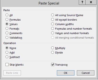 that allows you to do several possible things with the data you selected
when you paste it. From the "Paste" area, change from "All" to "Values";
this will just paste the numbers and letters, but will omit formatting
and any cell formulas that may mess up the resulting table. Finally,
click on "Transpose" (which is in the lower-right of the dialog), which
means to swap the rows and columns. Click "OK". You'll see that your
table has the same data values as before, but now the types are row
labels, and the summary labels are in the columns.
that allows you to do several possible things with the data you selected
when you paste it. From the "Paste" area, change from "All" to "Values";
this will just paste the numbers and letters, but will omit formatting
and any cell formulas that may mess up the resulting table. Finally,
click on "Transpose" (which is in the lower-right of the dialog), which
means to swap the rows and columns. Click "OK". You'll see that your
table has the same data values as before, but now the types are row
labels, and the summary labels are in the columns.
This method works fine, but the pasted cells are no longer a pivot table.
b. Method 2 - you can re-arrange the pivot table structure. Select a cell inside the table to activate the PivotTable editing tools again. Now, in the lower right boxes you can drag "type" from column labels to row labels. The resulting table may have all the summaries stacked on top of each other - if so, fix this by dragging the "Σ Values" row label into the Column Labels area. This should give you the table you want, with types as row labels and summary types as column labels.
We won't be using the "Filters" option today, but it does what you might expect from our filtering exercise, above - if you were to drop the leaf type variable into the "Filters" area, you could use that to show just one leaf type or the other in the pivot table.
11. Un-stack the data. The reason we sequentially numbered the leaves in Sheet1 was to make it easy to un-stack one of the columns of data into a column for each leaf type using a Pivot Table. Although I want you to use stacked data whenever possible, there are times that you might need the data in an un-stacked arrangement (there are some statistical tests in MINITAB that require un-stacked data, for example).
To un-stack a column, switch back to Sheet1 and insert a new Pivot Table (make a new one instead of changing the one you've already made, we're not done with it yet), and then use leaf.number as the Rows, and type as the Columns. We now just need to put whatever variable we want to un-stack into Values - drag mass into the Values, and you will see a column for G leaves and a column for T leaves of masses. Excel tells you it is using the "Sum of mass", but since each row is a unique leaf number the sums are actually just data values.
Blanks and zeros
Spreadsheets make a distinction between missing values and measured zeros. A measured zero is an actual data value that was observed to be equal to zero. A missing value is a data point with an unknown value (because it was never measured, equipment failed, a computer crashed, or whatever), and shouldn't be assumed to be zero (or any other number, for that matter).
We can see how Excel makes a distinction between the two very easily, because all of the formulas and the pivot table itself are all linked to the leaf data set. If we change a data value, we just need to update the pivot table and the calculated values will update as well.
12. Change a data value to zero, and update the pivot table. We will now change a data value in Sheet1 to a 0 and see what it does to the summary statistics in the PivotTable.
- Switch back to the data in Sheet1.
- Sort on the original order to get the data back to its original sort order.
- Change the mass in the first row from 4 to 0.
- Switch to the pivot table we use to calculate means, standard deviations, and sample sizes for mass. Right-click a cell within the table, and select "Refresh", and as you do so watch how the numbers in the table change. Since you changed one of the tree leaf masses to 0 the average and standard deviation for leaf should change. Sample size doesn't change, however, because the 0 is considered a measured value.
13. Delete a data value and update the pivot table. Now we will see how things change when we delete the data value in Sheet1 instead of setting it to 0.
- Switch back to the data in Sheet1 and delete the 0 you entered (use either backspace or delete - these are not the same in Excel, but either will work here).
- Now, back to the pivot table, and refresh again. Since a data value is missing, the average, standard deviation, and the sample size all change. The average should change less than when the value was set to 0, because the 0 mass dragged the average down.
Assignment
That's all for today - save your spreadsheet and upload it to the class web site.