Introduction
Have you ever noticed that you often get a cold when you come back to school in the fall after summer break? This happens, not because viruses go dormant over the summer, but because you and your classmates have been apart for a few months, possibly traveling all over the globe, and when you start attending classes in the fall you have an opportunity to share any brand new cold viruses any of you have acquired while you were away.
In everyday language, a tendency for one thing to happen when another thing happens is called a correlation. In this sense, arriving back to school is correlated with catching a cold.
In statistics, correlation refers to the tendency for observations of two different variables to change together in predictable ways. We use measures called correlation coefficients to quantify this co-variation between variables. There are several correlation coefficients in use, but we are going to focus on one that is used with two continuous numeric variable, called the Pearson correlation coefficient. The standard symbol for the Pearson coefficient is r.
Let's look at some data that will help us understand what r can do for us.
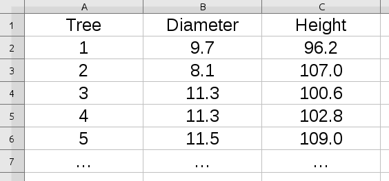 |
We measure the correlation between two different variables measured for each subject we observe. In this example, we have measurements from some trees, with the first five measurements shown. The first column, Tree, is just a number assigned as a label for each tree measured. The two variables measured are Diameter and Height. We need to have a measured diameter and height for each tree to calculate the correlation between the variables. |
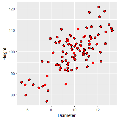
The standard way of visualizing the relationship between pairs of measurements on two numeric variables is with a scatterplot, like this one. Each point is an observation (i.e. one tree), and the coordinates on the graph are the tree's diameter and its height. The appearance of the scatterplot will depend on whether diameter and height have a predictable positive or negative relationship. Strong relationships will show data points that fall along a diagonal line on the graph (an imaginary one - lines are often not plotted in correlation analysis). You can see from this scatterplot that there is a pretty strong, positive relationship between height and diameter - as the diameter increases, so does the height of the tree. The relationship is clearly not perfect, though - it's possible to have a diameter of 10 and have heights that range from about 95 to 110, so knowing the diameter doesn't tell you what the height is exactly, but there does seem to be a general trend from trees that are skinny and short to trees that are thick and tall across the graph. |
|
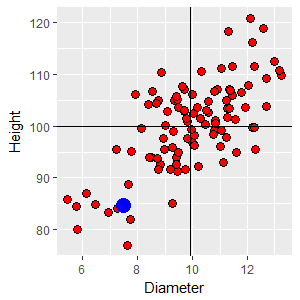
To better understand what it means to have a positive trend on the graph, we can draw a horizontal line at the mean height of 100 and a vertical line at the mean diameter of 9.9. Any data point in the upper right quadrant formed by these lines is both bigger around than average (i.e. above the mean diameter) and taller than average (above the mean height). If you selected any point in that quadrant and subtracted the mean diameter from the point's diameter you would get a positive number (that is, xi - x̄ = +), and if you subtracted the mean height from the point's height you would also get a positive number (yi - ȳ = +). Click on the image and you'll see a +,+ in that quadrant that indicates that all of the points would have a positive difference for both diameter and height, respectively. Likewise, if you selected a point from the lower left quadrant the differences between point values and means would be negative for both diameter and height. Click on the image again and a -,- will appear. The other two quadrants would give you a mix of positive and negative differences. In the upper left the points have smaller diameters than average (negative difference) but are taller than average (positive difference), so the differences there are -,+. The lower right points have a larger than average diameter, but are shorter than average, which would give differences that are +,-. Click on the image to see these labeled as well. Given this, you can see that there are more points in quadrants
where the signs on the differences are the same (upper right and
lower left) than in the quadrants in which the signs are
different (upper left and lower right). This is what gives us
the visual impression of a trend from lower left to upper right. |
Quantifying correlations - the Pearson correlation coefficient
|
We can make use of these differences to calculate the Pearson correlation coefficient, r. To start, we will standardize the differences between data values and means by dividing the differences by the standard deviation for the data. If you recall from our unit on the normal distribution this is a z-transformation, and the result is a z-score that indicates how many standard deviation a data point is from the mean. The table to the right gives means and standard deviations for the two variables in the tree data. |
|
|
zD1 = (12.09 - 9.9)/1.72 = 1.27 zH1 = (120.83 - 100)/8.68 = 2.40 This tree is 1.27 standard deviations above the mean in diameter, and 2.40 standard deviations above the mean in height. Using z-scores removes the units - we divided the difference (which has units of the variable) by the standard deviation (which has units of the variable), which causes the units to cancel. The next step is to multiply the two z-scores together: zD1 x zH1 = 1.27 x 2.40 = 3.048 |
|
The next data point we'll work with is from the lower left quadrant, with a diameter of 7.49 and a height of 84.61. This tree is both skinnier and shorter than average, so the two z-scores will both be negative: zD2 = (7.49 - 9.9)/1.72 = -1.40 zH2 = (84.61 - 100)/8.68 = -1.77 Since both of the z-scores are negative their product is positive: zD2 x zH2 = -1.40 x -1.77 = 2.48 |
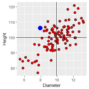
One final example from the upper left quadrant. This point has a diameter of 7.92 (below average) and a height of 106.12 (above average). The z-scores are: zD3 = (7.92 - 9.9)/1.72 = -1.15 zH3 = (106.12 - 100)/8.68 = 0.71 With one positive and one negative z-score the product is negative: zD3 x zH3 = -1.15 x 0.71 = -0.82 |
If we completed these calculations for all 100 trees we would have products of z-scores for every tree. Summing these products of z-scores gives us a positive value (68.7), because most of the points are in quadrants that have matching signs. If we then divide this sum by the degrees of freedom (which is the number of trees minus one, 100 - 1 = 99) we get:
r = (ΣzDzH)/(n-1) = 0.694
The Pearson correlation coefficient, r, is thus an average product of z-scores for a set of data. You can think of r as a measure of the relative strength of the association between two numeric variables like diameter and height. Since we based it on z-scores r does not have units.
The formula using z-scores is the easiest to understand, given how correlations are explained, above. The typical formula you will see in textbooks is:

This version is easier to compute with a calculator, but is less easy to understand. The numerator is a sum of cross products, in which the differences between data values and means for each variable are calculated and multiplied together - this is what gives the correlation coefficient its sign. The denominator scales the correlation coefficient to fall between -1 and 1.
Enter a value for r (between -1 and 1)
r =
You can use the graph to the left to see what a scatter of 1000 data points looks like at any correlation coefficient you specify (between -1 and 1, that is). Initially r is set to 0, which means that the variables are independent, and the graph looks like a shotgun blast with no trend in the data. A correlation coefficient of r = 0 tells us that there is no relationship between the variables.
As you change the correlation coefficient, see if you can observe the following properties of r:
- A perfect positive correlation of r = 1 occurs when the data fall perfectly along a straight line of positive slope
- A perfect negative correlation of r = -1 occurs when the data fall perfectly along a straight line of negative slope
- We interpret both the absolute value (that is, the magnitude) and the sign (that is, the direction) of the relationship.
- A positive relationship means that both variables are changing in the same way at the same time - you can think of them as either increasing together, or decreasing together. A negative relationship means that the variables are changing in different directions - one increases as the other decreases.
If you want to see more than one data set at the correlation coefficient you chose, click the "Select another with this r" button. You'll see that particularly at r values less than about 0.5 the scatters don't show much of a relationship on the graph. The data don't start to look clearly related until r is into the 0.6-0.7 range.
Testing a correlation for statistical significance
We calculate correlation coefficients from samples of data, and they are subject to random sampling variation, just like any other statistical measurement. We thus have to be concerned about whether a correlation coefficient represents a real relationship between the variables at a population level, or just a chance association in the particular sample of data we've measured. We need to test whether the correlation coefficient for our sample is big enough to treat it as a real correlation. To do this, we need to define a null hypothesis to test.
Null hypothesis
Look at the graph to the right - initially you will see the same 100 data points as in the first graph, above, from which we calculated a moderately strong correlation between diameter and height of r = 0.694.
When you click the "Select a new random sample" button you will get a new, randomly generated data set of 100 points. From this point on, every time you click the two sets of numbers are randomly selected independently, which means that at a population level the correlation between diameter and height is ρ = 0 (ρ is lower-case Greek rho, and is the standard symbol for the population correlation coefficient. r is an estimate of ρ). The graph to the right illustrates the null hypothesis for correlation analysis - at a population level there is no correlation, but you'll see that the numerical value for r in random samples you generate is almost never 0.
Symbolically, the null hypothesis is:
Ho: ρ = 0
The alternative is that the correlation is not equal 0, or:
Ha: ρ ≠ 0
Sample size
If you keep the sample size at 100 and click on the graph repeatedly you'll see that most of the scatters of random data look like a shotgun blast, and the reported values of r are small. These small correlation coefficients make our observed correlation of r = 0.694 look pretty big, because correlations that big don't occur by chance very often.
However, our confidence in an r = 0.694 is less when the sample size is lower. Change the sample size to n = 10 and click on the graph repeatedly again, and you'll see that bigger correlation coefficients can happen by chance when the sample size is small. You will probably see one or more random samples with correlation coefficients as big as 0.694 - with a smaller sample size we would be less certain our correlation coefficient reflected a real relationship between diameter and height, because large correlations occur by chance more often when the sample size is small.
If you set the sample size to n = 1000, you'll see that the correlations become consistently very small, close to the population value of 0 that they are estimating. Our correlation coefficient of 0.694 looks very convincingly non-random if we have a big sample size, and in fact we would have been confident that a much smaller value of r was non-random, given how tiny the random values become at such a large sample size.
With that in mind, we can move on to a formal test of the hypothesis that diameter and height are independent of one another.
Test statistic
Next, to test the null we need a test statistic that we can use to obtain a p-value. You would think that the test statistic would be r, but that's not the case. Instead, we convert r to a t-value, and then use the t-distribution to do our test. The formula for the t-value is easy - it's simply:

The numerator is the correlation coefficient from our sample (0.25). The denominator is the standard error of the correlation coefficient, which we can get with the formula:

Plugging this into the denominator of the formula for t gives us:

p-value, or critical t-value
With this observed t-value we can use the t-distribution to obtain a p-value, or we obtain a critical value from a t-table and check whether our observed t is bigger than the critical value.
In either case, the degrees of freedom for the test is the number of subjects minus 2, or 100 - 2 = 98. We subtract 2 instead of 1 because we use an estimate of the mean for each group to calculate r.
Using the t-table on the class web site, with df = 98 and an alpha level of 0.05, the critical t-value is 1.98. Since the observed t of 9.51 is bigger than this, we reject the null - the correlation between diameter and height is significant.
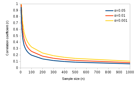
The smallest correlation that would be significant at any given sample size is the critical value for r, and the graph below shows how sample size affects your ability to detect significant correlations.
Critical values of r
|
This graph confirms the impression we got, above, when we simulated random data sets at different sample sizes. You can see from this graph that at small sample sizes only really strong correlations would be significant. At a sample size of 4 only correlations of 0.95 or more would be significant (these are absolute values, so above 0.95 or below -0.95 would be significant). What is the smallest correlation that would be significant with our sample size of 100, at an alpha of 0.05? Click here to see if you're right. |
As the sample size increases further it's possible to detect smaller
and smaller correlations between variables. With a sample size of 1000
any correlation greater than 0.062 would be significant. A correlation
between diameter and height of r = 0.062 is a very, very weak tendency
for height to increase as diameter increases, and the graph would not
show much of a discernible relationship. At a sample size of 1000 a
correlation of 0.104 or higher would be significant at an alpha level of
0.001, which indicates a "highly significant" relationship, but it would
still be barely visible in a graph.
So, once again, statistically significant doesn't necessarily mean important. Tiny correlations can be significant if the sample size is very large, but they don't help much in predicting the value of one variable based on knowledge of the other.
Assumptions of correlation analysis
Correlation analysis has the usual general statistical assumptions - random sampling, and independence between subjects. Note that the assumption is not that the two variables you are measuring are independent - dependence of the variables is what the correlation coefficient is measuring - but rather that each subject measured is independent of all the others.
Assumptions specific to correlation analysis are:
- Normality - each variable is assumed to be normally distributed. This can be checked with an AD test on each variable.
- Linearity - the relationship between the two variables has to follow a straight line. It's possible to have very strong relationships between variables that do not follow a straight line, but r will do a poor job of measuring non-linear relationships.
- Adequate sample size - it is unwise to calculate correlation coefficients on very small samples. At the extreme, two points define a line, and thus any two points will fall perfectly along a single line. A sample size of two will always result in r = 1 or r = -1, but this is a side effect of very small sample size. Additionally, the p-values used to assess statistical significance are based on an approximation of the normal distribution, and this approximation isn't reliable below a sample size of 10. Correlation coefficients are best used with sample sizes of 10 or more.
Correlations in morphometrics
The study of the relationships among various body parts is called morphometrics. We will be doing some morphmetric analysis for our activity this week, using measurements of our arms, legs, and heads. To prepare you for the activity, we will go over how to interpret morphometric data as it pertains to the relationship between arm lengths and leg lengths in a sample of people.
If we measured several people's arm and leg lengths and plotted them in
a scatter plot, we might get something like the graph below.
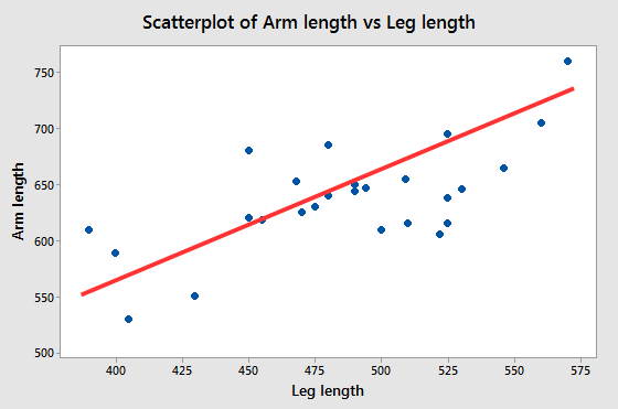 |
What understanding of the relationships can we gain from this graph? The red line illustrates the general tendency for arm length to increase when leg length increases, and you can think of the red lines as being a depiction of the correlation between the variables. The correlation is positive, but it isn't equal to 1 (do you know how we know this? Click here to see if you're right.) So, we have a line that represents the correlation between arm and leg lengths, and scatter around it. What does this tell us about the relationship between arm and leg lengths? |
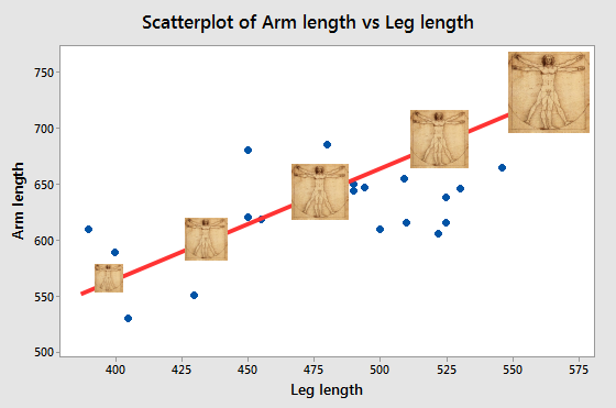 |
The line itself, and the correlation coefficient it represents, show us there is a consistent, linear scaling between arm length and leg length. If you look at the illustration to the left, Da Vinci's Vitruvian Man sitting on the line at about 400 mm leg length and the one sitting on the line at 575 mm are proportionately the same, and are just scaled to different sizes. The ones in the middle are similarly just the same image at a different magnification - all the parts are increased or decreased by the same amount. The red line represents this pattern in the data. When we are working with measurements of body dimensions (morphometrics) a statistically significant correlation is an indication of consistent variation is size. |
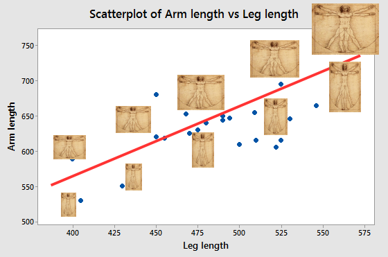 |
But, notice that not all the points fall on the line. Points that are not right on the line either have long arms for their leg lengths (which puts them above the line) or have short arms for their leg length (which puts them below the line). We can see this by moving the images off of the line and scaling them to either have longer or shorter arms than the original images. When we are working with morphometric data, the scatter around
the line indicates variation in shape. We can
thus use the fact that there is scatter as an indication that
there is shape variation in the data. |
So, then, when we correlate morphometric variables, the correlation itself is the indication of consistent variation in size, and the fact that the correlation isn't perfect is an indication that there is some degree of shape variation as well.
Why does correlation not prove causation?
You have probably heard by now that "correlation does not prove causation". This is sometimes, incorrectly, stated as "correlation does not imply causation", but that's taking the point too far - when there is a cause and effect relationship between variables there will generally be a correlation between them, so correlation implies that there might be a cause and effect relationship. But, it's also possible to have a correlation without a cause and effect relationship, so the fact that variables are correlated doesn't prove that there is a causal link between them.
 |
As an example, consider the hypothetical case in which we observe that increases in fishing effort are correlated with declining numbers of sea otters - a negative correlation would result. |
 |
What could cause this correlation? One possibility is that the fishermen are killing otters (perhaps accidentally catching them in their nets). The arrow with a negative sign above it indicates a direct negative effect of fishermen on sea otters. In this case there would in fact be a direct cause and effect relationship between numbers of fishermen and otter population size, and if we were to correlate amount of fishing with number of otters we would measure a negative correlation between them. So, why doesn't this correlation prove a negative effect of fishermen on otters? |
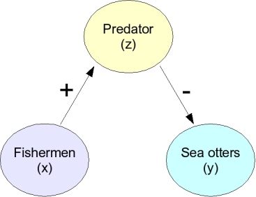 |
Consider this possibility. It may be that fishing attracts animals that prey on sea otters, like sharks, and that it's predation that reduces otter populations. In this case fishing has a positive effect on a predator (arrow with a +), and the predator has a negative effect on the otter (arrow with a -). This could still be considered a negative relationship between fishing and otters, but it's indirect, and very different than the first case. |
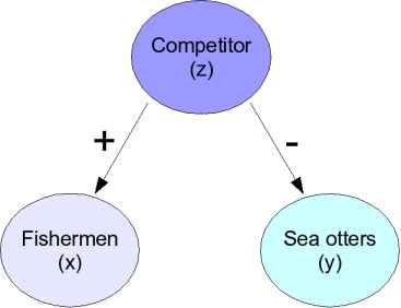 |
Another possibility looks like the one on the left - it could that the fishermen are attracted to a species that is a competitor of the sea otters. When the competitor is abundant the fishermen go find them, and there will be more fishermen. At the same time, the competitor drives away the sea otters. In this case the negative correlation between fishermen and sea otters is just a side effect of both having a relationship with this other species, and the fishermen aren't affecting the sea otters one way or another. |
Because we are only observing the relationship between fishermen and sea otters rather than experimentally setting the number of fishermen and observing a response in numbers of otters we cannot tell these different possibilities apart. Since one of the possible causes of the correlation between fishermen and otters is occurring without any negative effect of fishermen on otters, we can't conclude just based on the negative correlation that fishermen are negatively affecting otters.
So, why do we bother measuring correlations at all if they leave so many unanswered questions? There are two good reasons.
The first reason to measure correlations is that when there is a cause and effect relationship between variables they are generally correlated, so a correlation can be the first step in understanding a system. Correlations are thus often the initial observations that lead to an experimental program. In the sea otter example, having initially detected the correlation between fishermen and otters, it's possible to hypothesize different reasons for the pattern and try to determine which is the correct explanation.
The second good reason for measuring correlations is that they can be useful in and of themselves, even if they don't represent cause and effect relationships. For example, in temperate areas such as the continental United States there is a correlation between the arrival of migratory birds, like the robin, and the beginning of the spring growing season. Weather conditions vary from year to year, and the best date to begin growing crops can be quite different depending on the year. Birds are closely tied to climate, and their arrival is often a good indicator that favorable growing conditions are starting. Because of this, farmers may be better off planting their fields when the robins arrive, rather than planting on the same calendar date every year, if robins are a better predictor of growing conditions than the calendar is. Obviously, it isn't necessary for the farmers to assume that robins cause warm temperatures for this correlation to be useful.
Next activity
This week we will see how performance on an eye test (the dependent variable) is affected by distance from the chart (the independent variable), and test the relationship using regression analysis. We will also test the significance of correlations between body dimension measurements we made in previous activities.
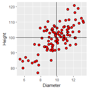
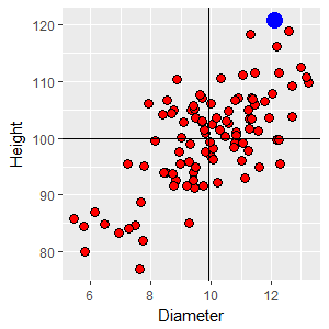 If we take a
point from the upper right quadrant with a diameter of 12.09 and
a height of 120.83, the z-scores for each variable are: