Lab 9 - GIS models and statistical models
Introduction
We are going to be building single-species reserves as the project for
this class, using a GIS modeling approach. Implicitly, we will be assuming
that anywhere a species' habitat is found, the species will also be found.
This is not an unreasonable assumption, or at least it is not without
justification. For example, we know:
- Species require suitable habitat to survive and persist
- In the absence of suitable habitat, the species will be absent in the
long term
- Many animal species are adapted to search for habitat, and plant
species often have adaptations that increase the chances that they will
end up in suitable habitat when they disperse
This rationale is the reason that the presence of suitable habitat is
commonly used as a substitute for actual data on distribution and
abundance of organisms in conservation planning. Censusing animal
populations over large areas is often impractical, but environmental
characteristics, such as vegetation, elevation, and climate, can be
remotely sensed and mapped over large areas.
GIS habitat models
We can think of habitat as being a set of environmental conditions that
have to be met for a particular species to successfully survive and
reproduce. Each of these conditions can be codified as a separate variable
(e.g. vegetation type, elevation, rainfall, etc.), and locations on a map
that meet all of the necessary conditions can then be used as a habitat
map for the species. To the extent that we expect the find the species in
its habitat, we can use a habitat map as a map of the predicted
distribution of the species. This approach forms the basis for much of
modern conservation planning, and you will use this approach in your lab
project.
There are two basic ways of translating habitat information into a
prediction of the distribution of a species. The first approach is to
build a GIS model by finding areas on the map that meet all of the
conditions. You learned last week to do this using vector polygon maps and
overlay functions (clip, erase, intersection, union). Today we will use
the raster calculator in Spatial Analyst to build a GIS model based on
raster data.

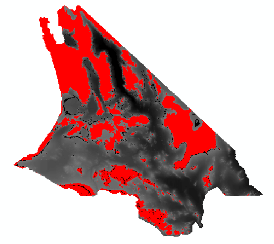
For example, if you know that a species occurs at elevations
above 1000 ft in the Mojave Desert, you could find locations
within the Mojave that meet this criterion, and use the result as
a predicted distribution of the species' habitat. An example,
using just elevation, looks like this map to the left. Areas that
are at or above 1000 ft are colored red, and this becomes our map
of predicted habitat for the species.
|

The weakness of the approach is that all areas that meet the
condition are treated as equally good habitat, which is probably
not true. If you recall from the ecology review we did at the
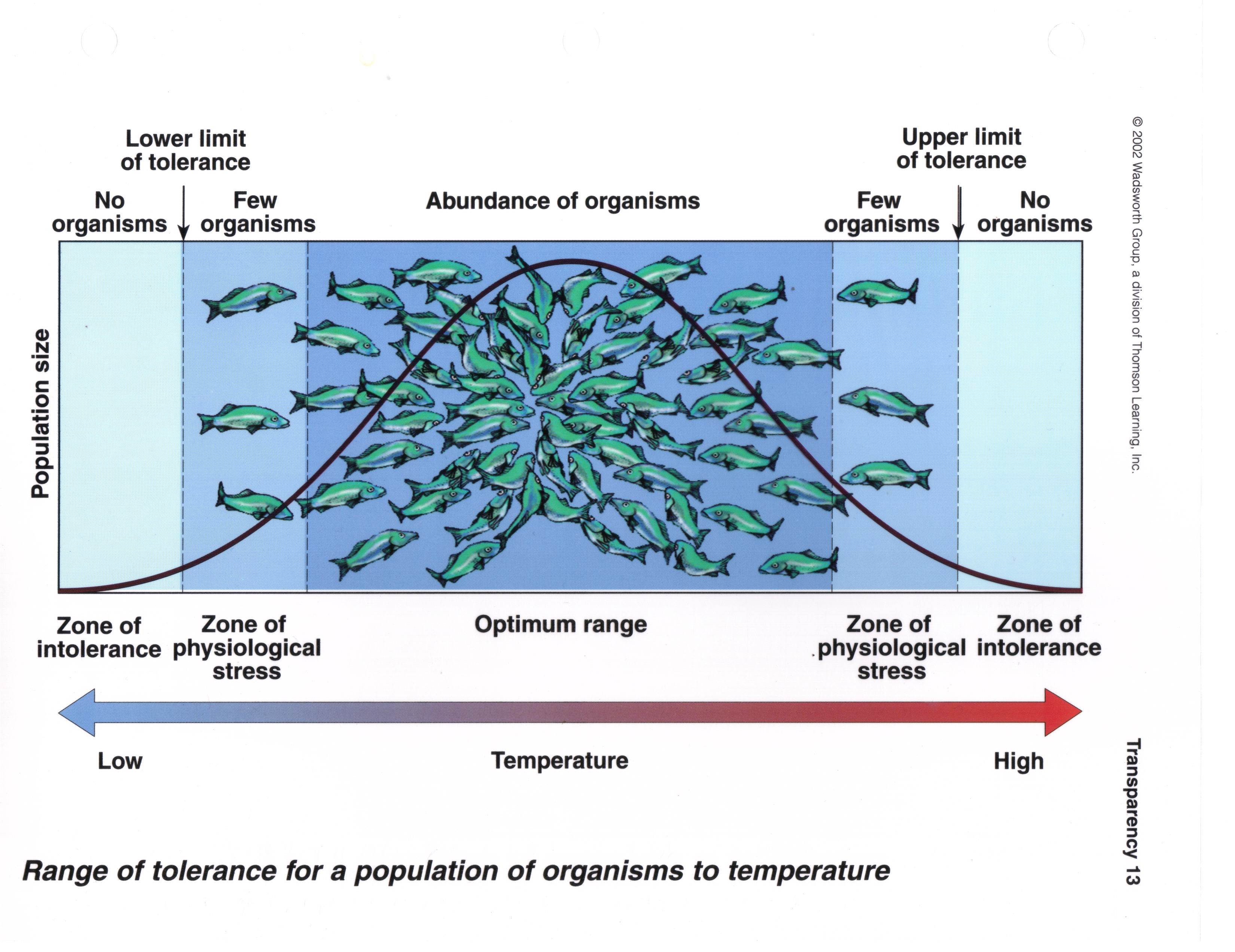
beginning of class, we expect that a species will respond to a
gradient in its environment, such as water temperature, like the
illustration to the left. The x-axis is temperature, and the
y-axis is population size - the black curve shows the expected
population size of this fish species as temperature changes (I
know there aren't a lot of fish in the Mojave, but this is the
best illustration of the point I could find. Work with me). At
very low temperatures the species is unable to survive, and it
should be absent. As the temperature increases, it gets just warm
enough for the species to survive - this is the lower limit of
tolerance. As the temperature continues to increase, we should
find increasingly dense populations of the fish until we reach the
best temperature for their survival and reproduction, where
abundance peaks. Above this peak the temperature gets too warm,
the abundance declines. Eventually the upper limit of tolerance is
reached, and the fish is unable to survival because the water is
too warm.
|
So, given this pattern, we can expect that the species will be abundant
where habitat conditions are good, rare where conditions are marginal, and
absent where conditions are unsuitable. As a species becomes increasingly
uncommon it becomes more likely that we won't see it if we go looking. If
we are sampling the environment for this fish by dropping nets into the
water and hauling up a catch, we would expect to consistently catch them
from water near the optimum temperature, but we will often miss them
entirely in water that has marginal temperature conditions. In other
words, you can interpret "Few organisms" on the graph as "only sometimes
present in samples at this temperature".
There is an additional issue that isn't illustrated in this simple,
single-variable GIS model. Habitat is multidimensional, and since
organism's habitat is usually defined by more than one variable, habitat
models are thus usually based on more than one variable as well. For
example, if we were working with a species that occurs above 1000 ft and
in areas with precipitation greater than 40 mm, we would use an elevation
layer and a precipitation layer, and every pixel that was both above 1000
ft and had precipitation greater than 40 mm would be identified as habitat
for the species. When we build a GIS habitat model, each of the criteria
we use is treated as equally important, but this is probably very rarely
true. In this example precipitation may be really important to the
species, and elevation may be less important, but there isn't any way to
represent this difference in a binary, yes/no GIS model.
Statistical habitat models, applied to maps
The second approach to predicting distributions is to 1) develop a
statistical model that relates the occurrence of a species to
environmental attributes found at a sample of locations, and then 2) use
the model to predict where the species should be across an entire region.
Exactly what is predicted depends on the statistical model used - a linear
regression might be used to predict abundance, and a logistic
regression might be used to predict the probability of the
organism's presence at a site.
Logistic regression is popular for this kind of work because it predicts
probability of occurrence, and probabilities can be used as a measure of
intensity of use. A probability of 0.8 is interpretable as an 80% chance
of finding the organism at a site, or equivalently, 80% of sites with
habitat characteristics like those found at the site would contain the
species.

Logistic regression also allows us to deal with cases in which we
have strong associations with some habitat variables, and weaker
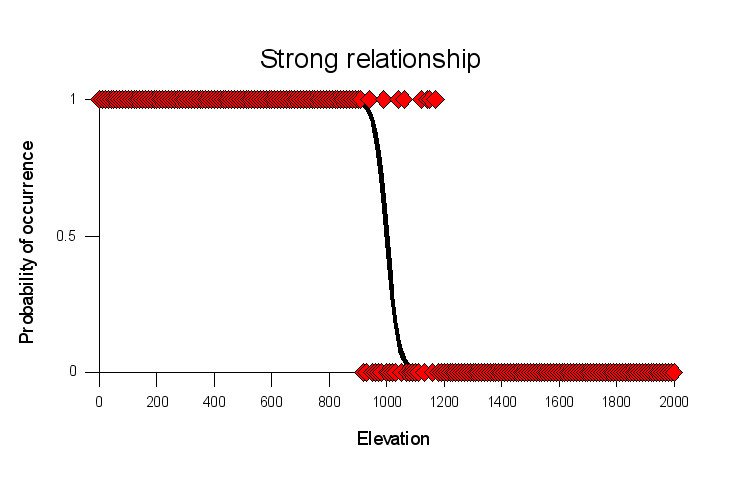
associations with others. The graphs to the left shows a
hypothetical set of locations that were sampled along an
elevational gradient; each red diamond is a different sample, and
places where this organism was found were assigned a 1, and places
where the organism was not found was assigned a 0.
This graph is called "strong relationship" because the line that
represents the statistical relationship between elevation and
probability of occurrence shows a steep transition from very high
probability of presence at low elevations, to a very low
probability of occurrence at high elevations. There is a narrow
range of elevations, between about 900 to 1100 ft, where the
species could either be present or absent, but there are no
absences below 800 feet and no presences above 1400 ft.
|

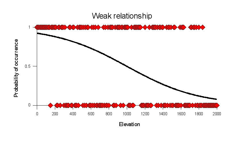
Compare the strong relationship above to this graph of a weaker
relationship. In this graph the species is present across nearly
the entire elevational range, but it is present with a greater
probability at low elevation than at high elevation. The s-shaped
curve that characterizes the statistical relationship between
elevation and probability of occurrence is less steep, and doesn't
asymptote at 1 or 0 like it did for the strong relationship. Both
curves show an inflection point at 1000 ft, where the curves cross
over a probability of occurrence of 0.5.
|
What does this mean in terms of use of habitat by the species? In both
cases the species is using the habitat non-randomly - it is selecting
habitat at low elevation. A species that used elevation at random would
have a flat line, at whatever proportion of the sites the organism
occupied overall (that is, if it was found at half the sites, it would be
a flat line at a probability of occurrence of 0.5). However, with the
strong relationship we are nearly guaranteed to see the species at sea
level, and very unlikely to see it at 2000 feet. With the weaker
relationship we have about a 95% chance of seeing the species at sea
level, and a 5% chance of seeing it at 2000 feet. The weaker relationship
suggests a that the species tolerates a fairly wide range of variation in
elevation.
This statistical approach addresses some of the disadvantages of the GIS
model. For example, differences in the predicted probability of occurrence
of a species can be interpreted as differences in habitat suitability,
i.e. habitat in which the species is always found (probability of
occurrence near 1.0) will be considered better habitat than one in which
the species is only found 75% of the time (probability of occurrence at
0.75). Additionally, as a built-in part of the statistical modeling,
variables that have only a small effect on probability of occurrence will
be weighted less than variables that have a large effect.
Uncertainty in predicted habitat
The GIS model above isn't based on probability, so we can think of the
GIS model as a definite prediction of presence or absence for a species,
with no uncertainty represented in the prediction. There is no easy way to
tell from the GIS model which habitat is best for the species and which is
only marginal, so it's difficult to know how likely we are to actually see
the species when we go to a spot on the map that predicts its presence.
For example, what if we went out in the field and surveyed for the species
and only found it present in 50% of the sites we sampled? This could be a
cause for alarm, if we sampled in high-quality habitat, but it could be
exactly as expected if it turns out we had sampled in areas that were only
marginally suitable.
Logistic regression models give us a more refined prediction, and we can
use the predicted probabilities of presence to help us interpret our field
data. If the species had a strong relationship with habitat, and the model
predicted a 99.9% chance of a species being present, then if we only found
the species in 50% of our samples, we could conclude either that the model
was wrong, or that the species might be suffering a decline. If we were
sampling in habitat that only had a 50% of containing the species, then
finding them only 50% of the time would not be a cause for concern.
Today we will build a GIS model, and equivalent logistic regression
models (one representing a strong relationship with habitat, one
representing a weak relationship), and we will compare the information we
can derive from each.
Exercise 1 - A GIS model of predicted occurrence
You will find the data you need in the Lab9_data folder on the P: drive.
We will be using data on elevation, January temperature, winter
precipitation, and summer precipitation to predict the distribution of a
hypothetical Mojave Desert species. The species is a low-elevation, dry
habitat specialist that does not tolerate frost. To translate this into a
GIS model, we will use the following criteria:
- The species is found at elevations below 1000 feet.
- It is found in places with average January low temperatures greater
than 0 degrees C.
- It is found in places with summer precipitation less than 40 mm
- It is found in places with winter precipitation less than 100 mm.
All of the data sets you have are raster files, so you can use the raster
calculator to derive the model in one step.
1. Add the files "elevation", "ppt_summer", "ppt_winter", and "temp_jan"
to your project.
2. You may need to turn on the Spatial Analyst extension (Customize →
Extensions, then make sure the box is checked next to Spatial Analyst).
In the ArcToolbox find Spatial Analyst Tools → Map Algebra → Raster
Calculator, and launch it. Bear in mind that the Raster Calculator is VERY
FUSSY about format. The safest way to build your model is to use the
calculator buttons. If you do choose to type commands, make sure you put
spaces, quotes, and parentheses where they are needed.
In the raster calculator, build the following expression (including the
parentheses around each comparison):
("elevation" < 1000) & ("ppt_summer" < 40) & ("ppt_winter"
< 100) & ("temp_jan" > 0)
Set the output map to "gis_model" in your lab9 folder (on the S: drive).
Although we are using a calculator, all of the operations are "boolean",
meaning they all evaluate as "TRUE" or "FALSE". Each of these statements
in parentheses use a comparison operator (either a < or a >), and
will evaluate as TRUE if a pixel meets the condition, and FALSE if it does
not. The ampersand character (&) means "And". "And" operations are
only true if all parts are true, so linking a string of comparisons
together with & only results in a TRUE every one of the conditions are
TRUE. If any of the conditions are FALSE, the entire statement is FALSE.
This is why all of the variables are considered equally weighted in a GIS
model, because each variable has a "veto power" over the rest. Click "OK"
to run the raster calculator.
The map should look like this (although
hopefully with better colors). The green areas are 1's (which to a
computer is the value for "TRUE"), which indicate the elevation, January
temperature, and winter and summer precipitation criteria are all
satisfied. The purple areas are 0's (which to a computer is the value for
"FALSE"), which indicates at least one of the conditions were not
satisfied.
Exercise 2 - Predicting occurrence with logistic regression equations
To illustrate the difference between GIS models and statistical models,
we will be using the results from a logistic regression, which I will
provide you, to predict the probability that our organism will occur
within a pixel given our four habitat variables. The lines in the figures
in the introduction are based on a single variable, and are generated with
the following equation:

Look for a minute at how this equation works. In the exponents of the
base e, there is a straight line equation (m is the slope, which here
indicates the strength of the relationship with elevation, and b is the
intercept that positions the curve along the x-axis). The straight
line equation in the exponents can predict either positive or negative
numbers. As you know, negative numbers in an exponent make the number
approach zero (remember, e-x is the same as 1/ex ...
as X gets infinitely large 1/ex gets infinitely small).
When the straight line part predicts large negative numbers the
exponentials approaches zero, and the equation predicts p = 0/(1+0) =
0. Big positive numbers predicted by the straight line part make the
exponentials very big. When the straight line part is very big the
exponential parts in the numerator and denominator dominate the
prediction, and the 1 in the denominator becomes increasingly unimportant
to the predicted probability. For example, if the exponential parts of the
equation equal 1000, then the predicted probability of occurrence will be
1000/(1+1000) = 0.999. When the straight line parts predict a value of 0,
then the exponentials become e0, which equals 1; the model then
predicts p = 1/(1+1) = 0.5, which is the "inflection point" at which the
shape of the curve goes from increasing to decreasing.
Another form of this equation is less easy to understand, but is easier
to compute:

This is the form we'll be using to make our predictions.
A nice feature of logistic regression (and of linear regression too) is
that you can add additional predictors by adding a slope multiplied by the
variable to the straight line part in the exponent, like so:

Here the straight line part in the exponent of the denominator still has a
single intercept, but has slopes for each of the variables included.
Although this looks complicated, it is really just a simple extension of
the first equation, and works the same way.
The slopes allow the variables to be weighted differently - a slope near
zero will cause the variable to have very little effect on the predicted
probability of occurrence, whereas a large slope will cause the variable
to have a big effect. Positive slopes mean that the probability of
occurrence increases as the variable increases, and negative slopes mean
the probability of occurrence decreases as the variable increases. Bear in
mind, though, that the slopes also adjust for differences in measurement
scale, so it's not easy to compare slopes between variables to figure out
which is most heavily weighted (for example, elevations range across
thousands of feet, while temperatures range across a few tens of degrees -
even if temperature and elevation are equally important to the species the
elevation slope will be smaller than the temperature slope because of this
difference in range). We would need to look at "standardized"
coefficients, which account for differences in measurement scale, to
compare among variables. For our purposes today, the important thing is
that using this approach allows the variables to have different degrees of
effect on probability of occurrence.
Because the equation is a little awkward to work with we will be doing
our predictions in two stages to prevent errors, and make them easier to
detect if they do occur. In the first stage, you will create a map
with the straight line part of the equation, which is:

and the second stage will take the straight line predictions and
plug them into the exponential function (which is e-y), and
predict probability of occurrence:

Simple, no?
First stage calculation:
We will use the following values for the "parameters" (the intercept and
slopes):
b = 17.848434
m1 = -0.000787
m2 = 2.24148
m3 = -0.171888
m4 = -0.118149
Open of the "Raster Calculator", and build the equation...
17.848434 - 0.000787 * "elevation" + 2.24148 * "temp_jan"
- 0.171888 * "ppt_winter" - 0.118149 * "ppt_summer"
you can accept the default output location (we don't need to save this
file, it's just a calculation step), but call it "stage1". If all goes
well this will give you a new layer that ranges from -123.699 and 15.0314.
Question: Do the signs on the slopes agree with the habitat
description for this species?
Click here
to see if you're right.
Positive signs mean a positive
relationship (as the variable increases the probability of occurrence
increases too), negative signs mean a negative relationship (as the
variable increases the probability of occurrence decreases). The species
likes low elevation (negative), high temps in January (positive), low
winter and low summer precipitation (negative).
Second stage calculation
Open the raster calculator again, and build the following statement:
1 / (1 + Exp( - "stage1"))
and call the output "strong_hab" (and place this in your lab8 folder).
Watch the negative before "stage1", you won't get the right answer without
it. The resulting map should have continuous numbers that fall between 0
and 1.
Predicted presence from probabilities
Although ultimately we might prefer the logistic regression-based model
to our original GIS model, it would be nice to compare their predictions.
We can't convert the GIS model to predicted probabilities, but we can
convert our probabilities to predicted presences. To do this, all we need
to do is to assign any predicted probability greater than 0.5 to a
predicted presence (1), and any predicted probability less than 0.5 to a
predicted absence (0). You can do this with the raster calculator with the
expression:
"strong_hab" > 0.5
Call the output file "strong_pres" (short for strong habitat, predicted
presence).
Why does this expression work? When we compare one value to another using
a comparison operator (such as =, >, <) we will either get a value
of "True" or "False". To a computer, "True" is equal to 1, and "False" is
equal to 0. We can take advantage of this behavior to round our predicted
probabilities to 1 and 0, which we can then use as a map of predicted
presence and absence.
Repeat for a weaker habitat association
What if the habitat association was weaker? Repeat the first stage
calculations using the following coefficients:
b = 8.924217
m1 = -0.0003935
m2 = 1.12074
m3 = -0.085944
m4 = -0.0590745
These are all 1/2 the value of the previous ones, which results in a
shallower curve that doesn't approach 0 or 1 rapidly. Use them to build
the expression:
8.924217 - 0.0003935 * "elevation" + 1.12074 * "temp_jan"
- 0.085944 * "ppt_winter" - 0.0590745 * "ppt_summer"
for the first stage calculation (call it "stage1_w" for the stage 1
calculation, weak habitat relationship).
Now, repeat the second stage calculation using stage1_w instead of
stage1, and save the resulting probability map as "weak_hab".
Predict presence and absence in the raster calculator using the
expression "weak_hab > 0.5", and call the resulting presence/absence
prediction map "weak_pres".
Now, it would be nice to be able to compare the weak habitat model to the
strong, but both are raster layers, and we can only look at one at a time.
Also, ArcMap scales the shades of gray to the numbers in the raster layer,
which makes the comparison more difficult - if they both used the same
color for the same probabilities it would be easier to see how they
compare. We'll fix the second problem first.
Double-click on weak_hab and switch to the "Symbology" tab. The layer
will have had a "Stretched" grayscale color ramp assigned to it, which is
okay but we want it to use the stretched grayscale ramp of the strong
habitat layer instead (we'll assign the strong to the weak rather than the
other way around because the strong covers a slightly wider range of
values). Click on the "Open file" (folder) button, and select the
"strong_hab" layer as the color ramp to import, and click "OK". The color
ramps are now the same between the layers, which means a shade of gray
means the same thing in both strong_hab and weak_hab.
Next, we want to be able to compare the layers more easily. We can't
display both at once, but we can "swipe" one, which will reveal the other
one. Select "Windows" → "Image analysis". In the list of layers, turn off
everything except weak_hab and strong_hab. Click on weak_hab to select it,
and then find the "Swipe layer" button, which is just above the
"Processing" area (it looks like this). If you
then click someplace over the map, you will see the weak_hab layer is
removed above your mouse, showing the strong_hab layer. You can click,
hold, and move your mouse to swipe away the weak_hab wherever you want, so
that you can compare the two layers more easily. You'll see that the only
difference between them is that the weak habitat association shows less
contrast (more shades of gray) than the strong habitat association, but
they both should show the same transition from probabilities less than 0.5
and greater than 0.5 occurs. Thus, the change is much like the change from
the strong relationship and the weak relationship illustrated in the
figures at the beginning of the handout.
You can also compare the strong_pres to weak_pres. As you change between
them you'll see color change, but the distribution of the 1's and 0's
should be almost identical between them. If you compare either of them to
the gis_model map, you'll see only minor differences between them. All
three are representing the same habitat association.
We will compare the maps in the next exercise.
Exercise 3 - Differences between GIS predictions and strong or weak
statistical models
You now have predicted distributions from a GIS model, and one strong
statistical model and a weak statistical model. How do they compare?
To explore this question, we will be subtracting the different
predictions from one another and comparing the results. For example, to
subtract the GIS model predictions from the predicted presence in based on
the strong habitat model, you would use the expression:
("strong_pres") - ("gis_model")
Call the output "st_pres_gis". Repeat this procedure, substituting
weak_pres for strong_pres (output should be wk_pres_gis).
The resulting maps should contain only three possible values: -1, 0, and
1. Places where the GIS model makes the same prediction as the statistical
model (i.e. the models "agree") you will have a 0. Places in which the
statistical model predicts presence and the GIS model predicts absence you
will have a 1, and places in which the statistical model predicts absence
and the GIS model predicts presence you will have a -1. The GIS model
should be similar to each of the statistical models, and you should have
primarily zeros (they would be identical if your instructor was more
clever, but I got them as close as I could).
How do the two statistical models compare? Subtract "strong_pres" from
"weak_pres." Lacking any rounding error they should be identical, but you
will probably see a few non-zero pixels.
GIS habitat models - no uncertainty represented, does that mean complete
certainty?
So, we now have probabilities of occurrence from the strong and weak
habitat models, as well as the GIS model predictions, and the
presence/absence versions of the strong and weak habitat models. A GIS
model, or a predicted presence/absence obtained from the probability
calculations, gives a uniform prediction of presence, with no uncertainty
represented. The logistic regression habitat models intrinsically
represent uncertainty, in the sense that a predicted probability of
occurrence of, for example, 0.75 tells us that we should expect 75% of
habitats like the habitat in the pixel to have the species present, and in
25% the species would be absent.
This becomes an issue in a couple of contexts. First is the "my favorite
pixel" problem. If you present a GIS map of habitat to someone who knows
the area that is mapped, they will point at a pixel on the map and say
"Your map says the species is absent here, but I saw it there just last
week". A predicted absence can mean the species is expected to be present
as much as 49% of the time, so this isn't necessarily a prediction
failure, it just appears to be one. The second problem is that it's really
important to validate a model by collecting new data and comparing the
model predictions to the data. A presence/absence map will only ever be
correct or incorrect, but in areas where the probability of occurrence is
0.51 you expect the species to be absent 49% of the time. Every time an
area that is predicted to contain the species does not, it will be scored
as a "commission error" - a predicted presence that is wrong. Large rates
of commission error are a strike against the habitat model, and it may
lead to the impression that the habitat model is incorrect. However, if
the actual probability of presence is 0.51, the model is only predicting
badly if either the species is present at a much higher rate or a much
lower rate than 51% of the samples. Using a probability-based habitat map
allows you to get a much more precise idea of the predictive accuracy of
the model, and can prevent you from throwing out a perfectly good habitat
model.
So, the question we will address now is, how much uncertainty in
predicted presence and absence is the habitat model obscuring?
To answer this question, use the Raster Calculator to subtract the
predicted presence for the strong model from the predicted probabilities
(that is: ("strong_pres") - ("strong_hab") ). Remember, the strong_pres
map is supposed to match the GIS habitat model exactly, but since they
aren't perfect matches we'll use the strong_pres map to compare against
the probabilities. That way we can just focus on the uncertainty that
comes from predicting presence/absence from a set of probabilities,
without having to account for the slight differences between the GIS map
and the statistical presence/absence maps.
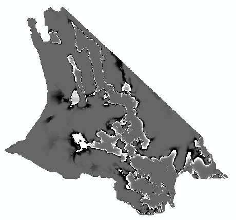
The map will look something like this:

The values will range from -0.49 to +0.49, with black indicating negative
and white indicating positive differences. Since we subtracted the
probabilities from the presence/absences, positives will be places that
were predicted present (1 - a probability), whereas blacks will be places
that were predicted absences (0 - a probability). The closer to white or
black, the greater the amount of prediction error we can expect. Places
that have a predicted "absence" (that is, those that were rounded down to
0) can be different from the predicted probability by as much as -0.5, and
places with a predicted "presence" (that is, those that were rounded up to
1) can be different from the predicted probability by as much as 0.5.
These are places where the presence of the species is maximally
unpredictable - whether the species will occur or not is the toss of a
coin.
Repeat this calculation with "weak_pres" and "weak_hab" (that is:
("weak_pres") - ("weak_hab") ). How do the differences compare between the
map of the strong relationship and the map of the weak relationship? Do
you see a greater amount of nearly white or nearly black pixels? This
would indicate a greater amount of uncertainty in our predictions of
presence or absence.
So, bear in mind: when we predict the presence of a species based on its
habitat needs, even if we understand the habitat associations well, we can
expect to sometimes fail to see them where they're predicted to occur, or
to see them where they are not predicted to occur. Locations that have
close to a 50% chance of occurrence are the most uncertain, and if the
habitat association is weak there may be a lot of area on the map that
gives only a moderate chance of the species being present. GIS maps aren't
immune from this uncertainty, but the way they are constructed doesn't
give us a way to assess our relative confidence in our predictions.
